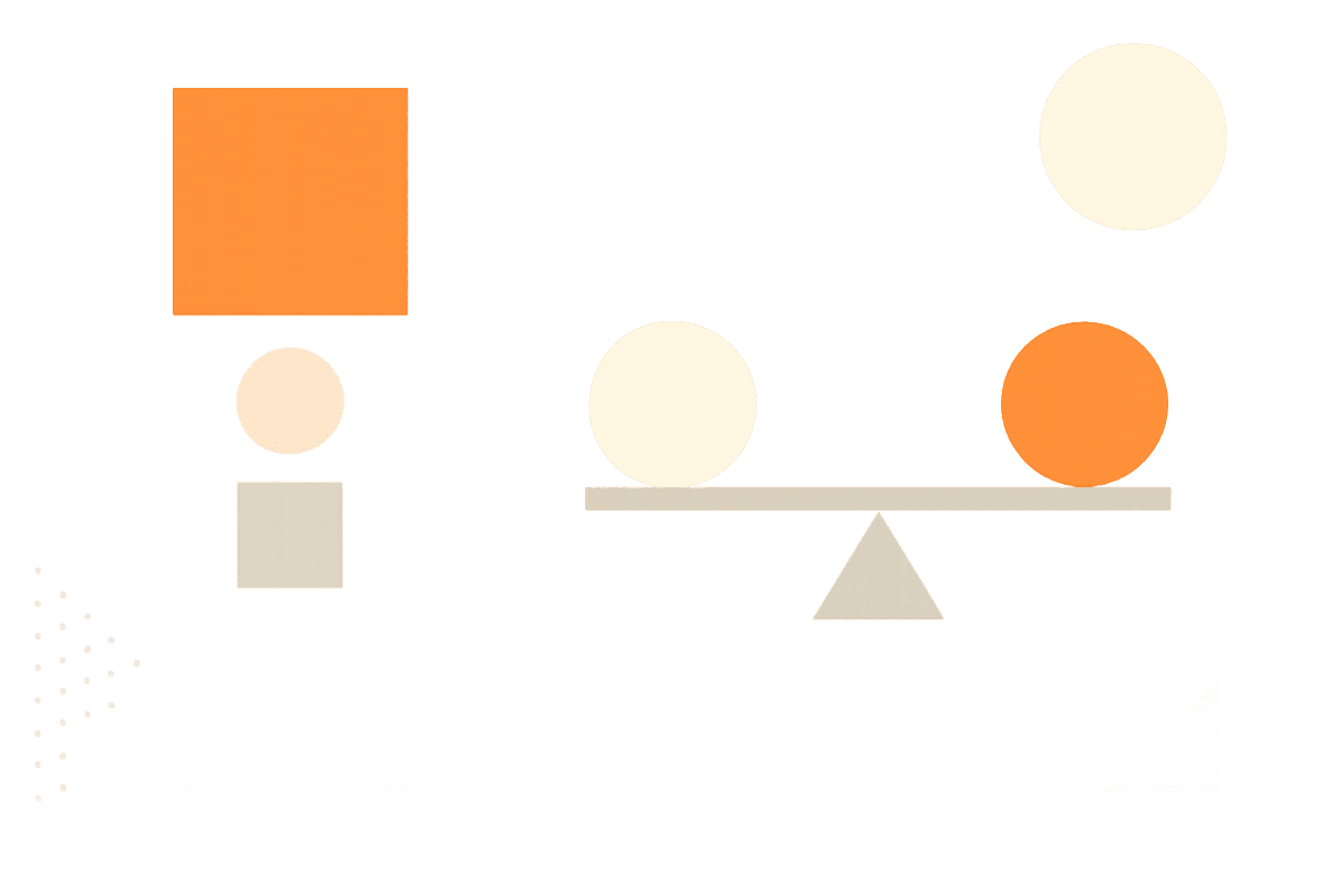

Balance
How elements relate to each other visually
Contrast
Creating visual differences that guide attention
Emphasis (Focal Point)
Directing attention to what matters most
Unity (Harmony)
Making all elements feel like they belong together
Proximity
Organizing information through spatial relationships
Repetition (Rhythm)
Creating patterns that unify and strengthen design
Common Design Mistakes
These mistakes can undermine otherwise good designs. Understanding what doesn't work helps you make better choices.
No visual hierarchy
When everything looks equally important, nothing stands out and viewers don't know where to focus
Fix: Create clear differences in size, weight, and color to establish what's most important
Poor color relationships
Random colors create visual chaos and can make text unreadable
Fix: Choose a limited palette with clear relationships (complementary, analogous, or monochromatic)
Inconsistent spacing
Random spacing breaks unity and makes designs feel unfinished or amateurish
Fix: Use a consistent spacing system - multiples of a base unit (8px, 16px, 24px, etc.)
Too many fonts
Multiple fonts create visual noise and break unity unless they're carefully chosen
Fix: Stick to 1-2 font families with different weights and styles for variety
Ignoring white space
Cramped designs are hard to read and feel overwhelming or cheap
Fix: Give your elements room to breathe - white space is not wasted space
Weak focal points
Without clear emphasis, viewers scan aimlessly and miss your key message
Fix: Use contrast, positioning, and isolation to create one strong focal point per section
Key Insights
Understanding why these principles work helps you apply them more effectively in your own designs.
Principles work together
These six principles don't work in isolation. Great designs use multiple principles working in harmony to create effective communication.
Example
A magazine layout uses proximity to group related content, contrast to create hierarchy, and repetition to maintain consistency.
Context determines application
The same principles apply differently based on your medium, audience, and purpose. A poster needs different emphasis than a mobile interface.
Example
Symmetrical balance works for formal invitations but asymmetrical balance might be better for dynamic web layouts.
Less is often more
Strong application of a few principles usually works better than weak application of many. Focus on getting the fundamentals right first.
Example
A design with perfect typography hierarchy and spacing can be more effective than one with lots of colors and effects.