Design Mistakes That Are Killing Your Portfolio 30 Specific Mistakes and Exactly How to Fix Them
Stop making these amateur mistakes that hiring managers notice instantly. Here are the specific errors that scream inexperience and the exact fixes that make you look professional.
⚡ TL;DR
- Most critical: Fix mobile responsiveness and loading speed first
- Biggest impact: Rewrite project titles to include specific outcomes
- Common mistake: Starting case studies with process instead of problems
- Quick win: Remove outdated work and focus on your best 3-5 projects
When great designers get overlooked
Your design skills are solid, but your portfolio is sabotaging you. Hiring managers scan portfolios in 6 seconds. These 30 mistakes make them move on to the next candidate before seeing your actual work.
The Brutal Reality
What Hiring Managers Actually Do
- •Scan portfolio in 6 seconds before deciding to continue
- •Check mobile responsiveness even on desktop
- •Look for outcomes first, process second
- •Skip portfolios with technical issues immediately
What Gets You Skipped
- •Slow loading or broken mobile experience
- •Generic project titles with no outcomes
- •Case studies that start with design process
- •No clear value proposition or personality
Here's the thing: most portfolio advice focuses on what to include. This guide focuses on what's actively hurting you. We'll fix the mistakes that make hiring managers skip great designers.
How This Guide Works
Each mistake includes the specific problem, why it hurts you, and the exact fix. Start with technical issues, then content, then visual polish.
The Mistake
What you're doing wrong
Why It Hurts
The impact on hiring
The Fix
Exactly what to do
Visual Design Mistakes
These visual mistakes make your portfolio look amateur even before anyone reads the content.
Using too many font families
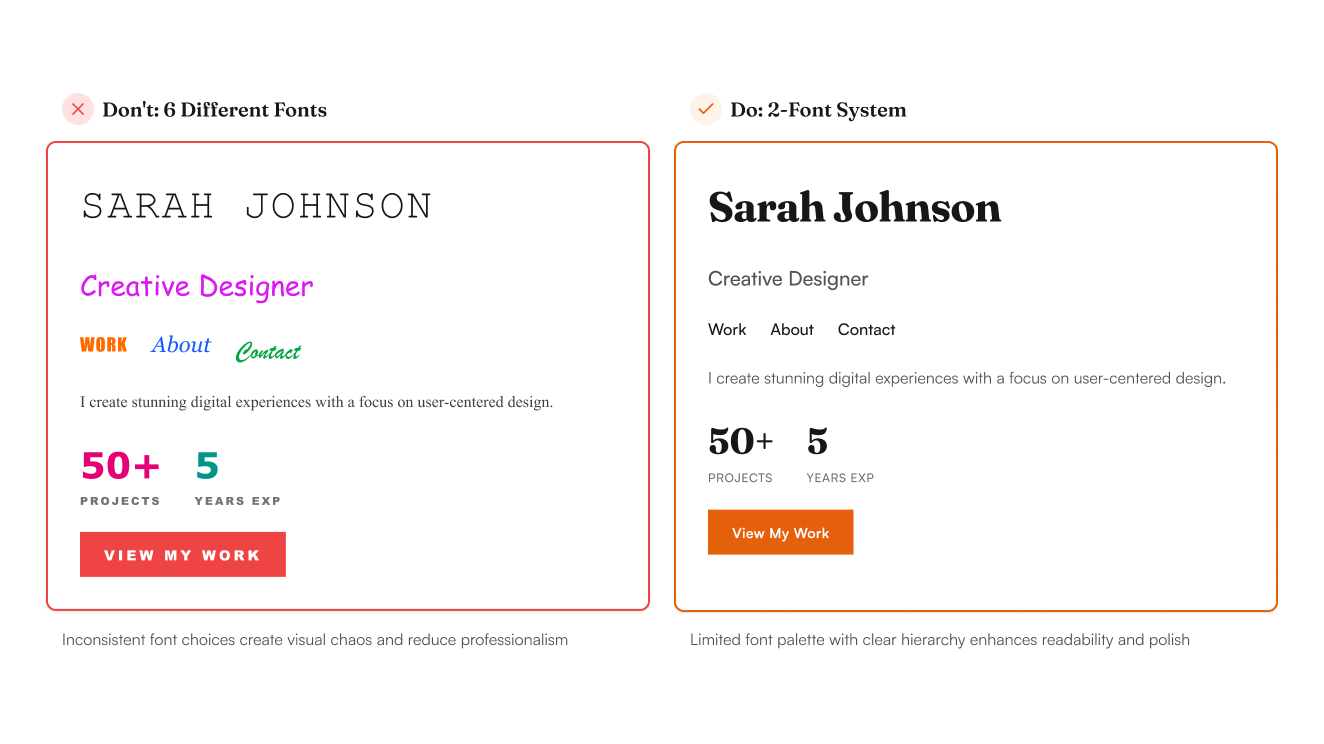
Problem
Creates visual chaos and looks unprofessional
Fix
Stick to 2 fonts maximum: one for headings, one for body text. Learn font pairing in our typography principles guide (/resources/typography-principles-guide)
Impact
Instantly makes your portfolio look more cohesive
Poor color contrast
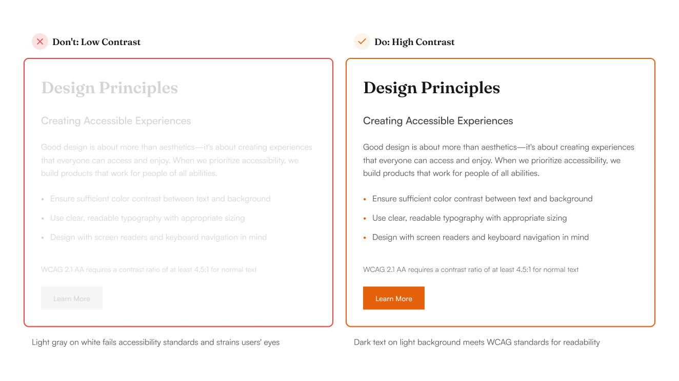
Problem
Text becomes unreadable, fails accessibility standards
Fix
Use contrast checker tools. Aim for 4.5:1 ratio minimum
Impact
Improves readability for all users including those with visual impairments
Inconsistent spacing
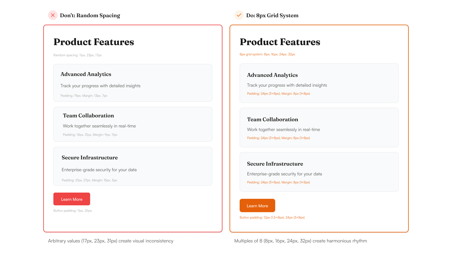
Problem
Makes layouts feel random and unprofessional
Fix
Use an 8-point grid system. All spacing should be multiples of 8px
Impact
Creates visual rhythm and professional polish
Overusing gradients and effects
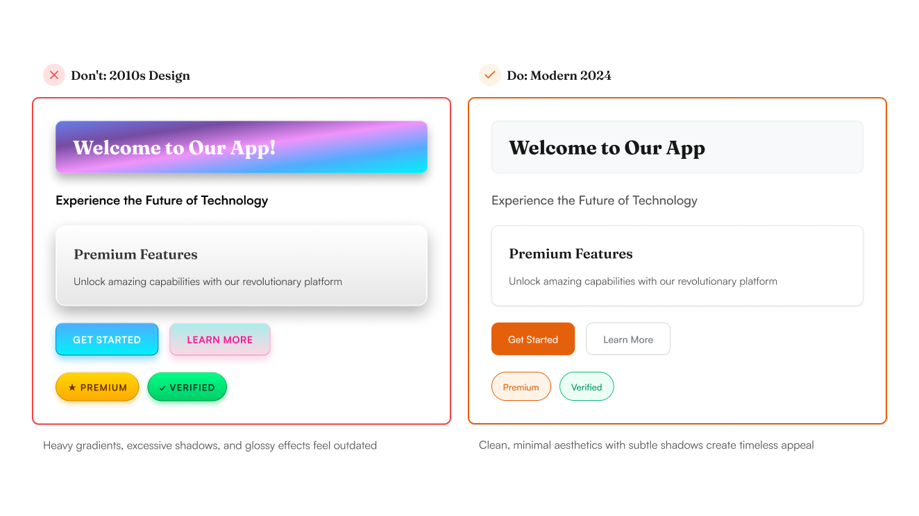
Problem
Screams amateur designer trying too hard
Fix
Use gradients sparingly. Focus on solid colors and clean typography
Impact
Creates timeless, professional aesthetic
Stock photo overload
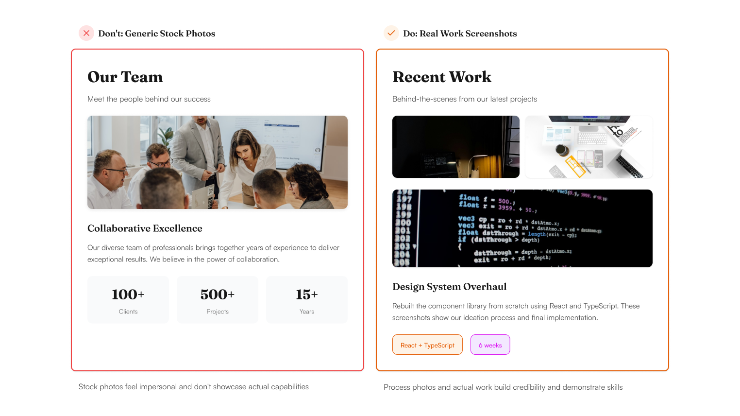
Problem
Generic imagery dilutes your personal brand
Fix
Use your own work, screenshots, or high-quality custom graphics
Impact
Showcases authentic work and creative thinking
Ignoring visual hierarchy
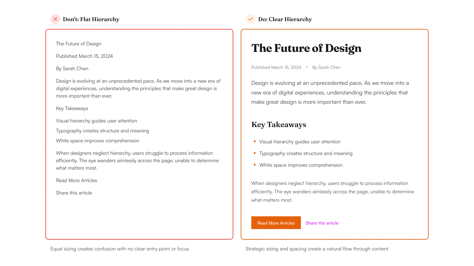
Problem
Viewers don't know where to look first
Fix
Use size, color, and spacing to guide the eye. Most important elements should be largest. Master visual hierarchy with our design principles guide (/resources/design-principles-masterclass)
Impact
Improves scanability and user experience
Content & Organization Mistakes
Poor content structure makes it hard for hiring managers to find what they need.
No clear navigation
Problem
Visitors get lost and leave quickly
Fix
Create simple, obvious navigation. Use standard labels like 'Work' and 'About'
Impact
Reduces bounce rate, increases time on site
Burying contact information
Problem
Interested employers can't reach you
Fix
Put contact info in header/footer. Include email and LinkedIn prominently
Impact
Makes it easy for hiring managers to contact you
Too much text in project previews
Problem
Overwhelming walls of text that don't get read
Fix
Use 1-2 sentence project descriptions. Save details for case study pages
Impact
Improves scanning and encourages deeper exploration
Missing or weak project titles
Problem
Generic titles don't communicate value
Fix
Use descriptive titles that include outcomes: 'E-commerce redesign → 40% more conversions'
Impact
Immediately communicates your impact
No filtering or categories
Problem
Reviewers can't find relevant work quickly
Fix
Organize projects by type, industry, or skill. Add filter options
Impact
Helps hiring managers find relevant experience faster
Outdated or irrelevant work
Problem
Shows you're not keeping up with current standards
Fix
Remove work older than 3 years. Keep only your best, most relevant projects
Impact
Portfolio feels current and focused
Case Study Problems
These case study mistakes make it impossible to assess your actual design thinking.
Starting with process instead of problem
Problem
Boring introduction that doesn't hook the reader
Fix
Open with the specific problem and its impact. Process comes later. Get the complete structure with our case study guide (/resources/case-study-structure-guide)
Impact
Grabs attention and shows business thinking
No metrics or measurable outcomes
Problem
Can't prove your design actually worked
Fix
Include specific numbers: conversion rates, task completion, user satisfaction scores
Impact
Demonstrates real business value of your work
Perfect linear story
Problem
Doesn't show real problem-solving skills
Fix
Include challenges, iterations, and what didn't work. Show the messy middle
Impact
Proves you can navigate real-world design challenges
All visuals, no narrative
Problem
Beautiful but explains nothing about your thinking
Fix
Balance visuals with clear explanations of decisions and rationale
Impact
Shows strategic thinking beyond visual execution
Vague problem statements
Problem
'Improve user experience' says nothing specific
Fix
Define specific user pain points with evidence from research or data
Impact
Shows you understand real user needs
Missing business context
Problem
Design exists in a vacuum
Fix
Explain business goals, constraints, and how your solution supports company objectives
Impact
Demonstrates business acumen and strategic thinking
Technical & UX Issues
Technical problems signal that you don't understand basic web standards.
Not mobile-responsive
Problem
Portfolio breaks on phones where 70% of viewing happens
Fix
Test on multiple devices. Ensure readable text and tappable buttons
Impact
Shows you understand modern web standards
Slow loading times
Problem
Impatient hiring managers leave before content loads
Fix
Optimize images, use proper file formats, implement lazy loading
Impact
Better user experience demonstrates attention to performance
Broken links or missing pages
Problem
Gives impression of carelessness and poor attention to detail
Fix
Test all links regularly. Use 404 pages that redirect to relevant content
Impact
Shows professionalism and quality control
No loading states or feedback
Problem
Users don't know if something is working
Fix
Add loading spinners, progress indicators, and success messages
Impact
Demonstrates understanding of interaction design
Poor accessibility
Problem
Excludes users and fails modern standards
Fix
Use semantic HTML, alt text for images, keyboard navigation support
Impact
Shows inclusive design thinking and technical competence
Generic or missing favicon
Problem
Missed opportunity for brand recognition
Fix
Create a custom favicon that represents your personal brand
Impact
Adds professional polish and brand consistency
Presentation Mistakes
These presentation issues make you forgettable even when your work is good.
Trying to show everything
Problem
Dilutes impact of your best work
Fix
Curate ruthlessly. Show 3-5 strong projects instead of 10+ weak ones
Impact
Quality over quantity makes stronger impression
No personality or voice
Problem
Forgettable portfolio that blends in with others
Fix
Inject personality through copy, design choices, and unique perspectives
Impact
Makes you memorable and shows culture fit
Weak or missing about page
Problem
Hiring managers can't assess cultural fit
Fix
Tell your story, show personality, explain your design philosophy
Impact
Helps hiring managers see you as a person, not just skills
No clear value proposition
Problem
Unclear what makes you different from other designers
Fix
Lead with a tagline that combines personality + specialty
Impact
Immediately communicates your unique value
Treating portfolio like a resume
Problem
Lists features instead of telling stories
Fix
Focus on outcomes and impact rather than just what you did
Impact
Shows results-driven thinking
Inconsistent branding
Problem
Looks thrown together, not professionally designed
Fix
Create a simple style guide for your personal brand and stick to it
Impact
Demonstrates systematic design thinking
Quick Fixes Checklist
Start here. These fixes provide maximum impact for minimum time investment. For a comprehensive evaluation, try our Portfolio Checklist Tool.
Immediate Impact (< 1 hour)
High Value (1-3 hours)
Strategic Improvements (3+ hours)
4-Week Improvement Action Plan
Transform your portfolio systematically. One week at a time, one improvement at a time.
Week 1: Foundation
Fix the technical basics that are actively hurting your portfolio
Tasks:
Week 2: Content Cleanup
Improve the content that hiring managers actually read
Tasks:
Week 3: Visual Polish
Make the visual design feel professional and cohesive
Tasks:
Week 4: Strategic Improvements
Add elements that differentiate you from other designers
Tasks:
Track Your Progress
Set up simple analytics to measure improvement. Look for increased time on site, more contact form submissions, and better response rates from applications.
Key Metrics to Track:
- • Average time spent on portfolio pages
- • Contact form submissions and response rates
- • Mobile vs desktop bounce rates
- • Most viewed projects and case studies
Fix Your Portfolio's Biggest Problems
Ready to eliminate the mistakes that are killing your portfolio? Get specific feedback on what's holding you back and exactly how to fix it. Not sure if you need help? Check our guide on signs your design needs professional review.
Design Mistakes Questions
Quick answers to help you get started
Share this resource

Written by
The CritPortfolio Review & Design Career Guidance
Designer, educator, founder of The Crit. I've spent years teaching interaction design and reviewing hundreds of student portfolios. Good feedback shouldn't require being enrolled in my class — so I built a tool that gives it to everyone. Connect on LinkedIn →
Too close to your own work?
Send one screen, case study, or URL. We'll show what's working, what's getting skipped, and what to fix next.
Continue Reading
All resources →Get one actionable portfolio tip every week. No fluff.
Short reads you can use on your site. Unsubscribe anytime.