⚡ TL;DR
- • Smart formats: WebP saves 30-50% file size vs JPEG
- • Quick compression: TinyPNG for batch processing
- • Responsive sizing: Multiple sizes for different screens
- • Better alt text: Describe what matters, not just what you see
Images Kill Portfolio Performance

Images dominate page weight — optimize them first
If your portfolio takes forever to load, it's probably your images. Unoptimized images are the #1 cause of slow portfolios — and the easiest fix.
What Massive Images Do to Your Portfolio
- •Google ranks slow sites lower
- •Visitors leave if it takes more than 3 seconds
- •Mobile users burn through data allowances
- •Hiring managers get impatient and close the tab
What Good Optimization Gets You
- •50-80% smaller file sizes without quality loss
- •Portfolio loads in under 3 seconds
- •Better mobile experience
- •More visitors stick around to see your work
Choose the Right Format
Not all image formats are created equal. Some give you tiny files, others give you perfect quality. Here's when to use what.
WebP
95%+ (with fallbacks) supportModern format with excellent compression and quality
Pros:
- +30-50% smaller than JPEG
- +Better quality at same file size
- +Wide browser support
Cons:
- -Not supported in older browsers
- -Requires fallback
Best For:
Example: Portfolio project screenshots, hero images
AVIF
70%+ (with fallbacks) supportNext-generation format with superior compression
Pros:
- +50% smaller than WebP
- +Excellent quality retention
- +Modern format
Cons:
- -Limited browser support
- -Requires multiple fallbacks
Best For:
Example: High-resolution portfolio images, detailed mockups
JPEG
100% supportTraditional format with universal support
Pros:
- +Universal browser support
- +Good compression
- +Widely supported
Cons:
- -Larger file sizes
- -Lossy compression
- -No transparency
Best For:
Example: Fallback for WebP, legacy browser support
PNG
100% supportLossless format with transparency support
Pros:
- +Lossless compression
- +Transparency support
- +Good for graphics
Cons:
- -Larger file sizes
- -Not ideal for photos
Best For:
Example: UI mockups, logos, graphics with transparency
SVG
100% supportVector format for scalable graphics
Pros:
- +Infinitely scalable
- +Small file sizes
- +CSS customizable
Cons:
- -Not suitable for photos
- -Complex graphics can be large
Best For:
Example: Portfolio icons, logos, simple illustrations
Quick Decision Guide
For Photos & Complex Images:
WebP first, JPEG fallback
For UI & Screenshots:
PNG or WebP
For Icons & Simple Graphics:
SVG when possible
For Future-Proofing:
AVIF with WebP/JPEG fallback
Compress Smart, Not Hard

Squoosh tool showing real-time image optimization with format conversion and quality adjustment
See How the Tools Work
Squoosh - Google's Free Tool:

Drag & Drop Interface

Size Reduction

Local Processing
Before: 2.4 MB
Original JPEG, high quality
Mobile users wait 8+ seconds
After: 180 KB
WebP format, 90% quality
Loads in under 1 second
92% file size reduction, same visual quality
You can cut file sizes in half without anyone noticing the difference. The trick is knowing which technique works for which type of image.
Lossless Compression
10-30% file size reductionReduce file size without quality loss
How It Works:
- •Remove metadata and EXIF data
- •Optimize color palettes
- •Use efficient encoding algorithms
- •Strip unnecessary data
Recommended Tools:
Best For:
PNG files, graphics, screenshots
Lossy Compression
50-80% file size reductionAcceptable quality loss for significant size reduction
How It Works:
- •Adjust quality settings (80-90% for photos)
- •Use progressive JPEG encoding
- •Optimize color space and bit depth
- •Remove unnecessary color information
Recommended Tools:
Best For:
JPEG files, photographs, complex images
Format Conversion
30-70% file size reductionConvert to more efficient formats
How It Works:
- •Convert JPEG to WebP
- •Use AVIF for high-quality images
- •Convert PNG to WebP when possible
- •Use SVG for simple graphics
Recommended Tools:
Best For:
Modern browsers, performance optimization
Quick Win: Batch Process Everything
Don't optimize images one by one. These tools can process your entire portfolio at once:
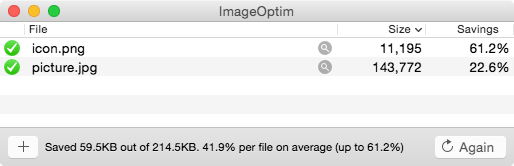
- • Mac: ImageOptim for drag-and-drop batch processing
- • Online: TinyPNG for up to 20 files at once
- • Code: Next.js Image component does it automatically
- • Manual: Squoosh for testing different settings
Free Image Optimization Tools
Free, simple image compression with format conversion
Most popular compression tool, drag and drop
Size for Every Screen
A 4000px image might look sharp on desktop, but it'll choke a mobile browser. Responsive images serve the right size to each device.
Multiple Sizes
Serve different image sizes for different screen sizes
Implementation:
- 1.Create 1x, 2x, and 3x versions of images
- 2.Use srcset attribute for responsive images
- 3.Provide fallback for older browsers
- 4.Optimize for common breakpoints
Recommended Sizes:
- Mobile: 400px, 800px, 1200px
- Tablet: 600px, 1200px, 1800px
- Desktop: 800px, 1600px, 2400px
Example: Portfolio project images that look crisp on all devices
Art Direction
Serve different crops for different screen sizes
Implementation:
- 1.Create landscape version for desktop
- 2.Create portrait version for mobile
- 3.Use picture element with media queries
- 4.Maintain important visual elements
Use Case:
Hero images, project covers, complex layouts
Example: Desktop shows full project mockup, mobile shows key detail
Aspect Ratio Optimization
Maintain consistent aspect ratios across devices
Implementation:
- 1.Use CSS aspect-ratio property
- 2.Implement object-fit for image scaling
- 3.Create consistent grid layouts
- 4.Avoid layout shift during loading
Benefits:
Example: Portfolio grid with consistent 16:9 aspect ratios
Load Images When You Need Them
Why load 50 images when visitors only see 3? Lazy loading defers images until they're about to come into view. Instant page load, same visual result.
Native Lazy Loading
90%+ (with polyfill)Use browser's built-in lazy loading
How to Implement:
- •Add loading='lazy' to img tags
- •Set appropriate loading priorities
- •Use loading='eager' for above-the-fold images
- •Provide fallback for older browsers
<img src='image.jpg' loading='lazy' alt='Description' />Benefits:
Intersection Observer
95%+ (with polyfill)Custom lazy loading with more control
How to Implement:
- •Use Intersection Observer API
- •Load images when they enter viewport
- •Add loading states and transitions
- •Implement error handling
const observer = new IntersectionObserver(callback, options);Benefits:
Library-Based
Use specialized lazy loading libraries
How to Implement:
- •Implement libraries like Lozad.js or LazyLoad
- •Add fade-in animations
- •Handle responsive images
- •Provide fallback images
Benefits:
Popular Tools:
Don't Lazy Load Everything
Some images should load immediately:
- • Hero images and above-the-fold content
- • Your profile photo or main portfolio image
- • Critical navigation or logo images
- • Anything visible in the first screen
Alt Text That Actually helps
Writing "screenshot" for every alt tag doesn't help anyone. Screen readers and hiring managers with disabilities need to know what your images actually show. Good alt text is good design. See our accessibility guide for more.
Portfolio Projects
Describe the project and its key features
✅ Good Example
"Mobile app dashboard showing user analytics with charts and navigation menu"
❌ Bad Example
"Screenshot of app"
Tips:
- •Include project name and type
- •Describe key visual elements
- •Mention the platform or device
- •Keep it concise but descriptive
Process Images
Explain the design process or methodology
✅ Good Example
"User research flowchart showing persona creation, user interviews, and insights synthesis"
❌ Bad Example
"Design process"
Tips:
- •Describe the step or phase
- •Include key insights or findings
- •Mention tools or methods used
- •Explain the visual flow
UI Mockups
Detail the interface elements and functionality
✅ Good Example
"E-commerce checkout page with shopping cart, payment form, and order summary"
❌ Bad Example
"Website page"
Tips:
- •List main interface elements
- •Describe the user flow
- •Mention key features or interactions
- •Include context about the user task
Decorative Images
Images that don't add meaningful content
✅ Good Example
""
❌ Bad Example
"Decorative background"
Tips:
- •Use empty alt attribute for decorative images
- •Don't describe purely aesthetic elements
- •Focus on functional vs decorative distinction
- •Consider if the image adds context
Alt Text Length Guide
• Aim for: 125 characters or less (screen reader comfort)
• Too short: "App screenshot" (doesn't help anyone)
• Too long: Full paragraph describing every pixel
• Just right: "Mobile banking app home screen showing account balance and recent transactions"
Tools That Actually Work
You don't need expensive software to optimize images. These tools handle 95% of optimization tasks, and most are free.
Squoosh
Google's web-based image optimization tool
Features:
Best For:
Quick optimization, format comparison, learning
Tool Interface:
Simple drag-and-drop interface
File size reduction visualization
Local processing for privacy
Visit: https://squoosh.app
ImageOptim
Mac app for lossless image optimization
Features:
Best For:
Mac users, batch processing, lossless optimization
Visit: https://imageoptim.com/mac
Platforms: macOS
TinyPNG
Online image compression service
Features:
Best For:
Quick compression, API integration, team workflows
Trusted by:


Visit: https://tinypng.com

Next.js Image Component
Built-in image optimization for Next.js
Features:
Best For:
Next.js projects, automatic optimization, development
<Image src='/image.jpg' width={800} height={600} alt='Description' />Implementation Checklist
Here's your action plan. Work through these phases in order—each one builds on the last.
Phase 1: Planning
Phase 2: Optimization
Phase 3: Implementation
Phase 4: Maintenance
Quick Test: Before vs After
Use these tools to measure your improvements:
- • Google PageSpeed Insights for overall performance
- • GTmetrix for detailed image analysis
- • Chrome DevTools Network tab for file sizes
- • WebPageTest for real-world loading times
Image Optimization Questions
Quick answers to help you get started