The Complete Design Portfolio Guide for 2026
Everything you need to build a design portfolio that gets you hired — structure, case studies, platforms, SEO, accessibility, and real examples.
⚡ TL;DR
- What this covers: Everything you need to build a design portfolio that gets interviews — from structure and case studies to SEO and accessibility
- Who it's for: Designers at any level who want a portfolio that works harder than their resume ever could
- The bottom line: A great portfolio isn't about flashy animations or trendy layouts — it's about showing how you think through problems and deliver results
Why Your Portfolio Matters More Than Your Resume
Here's something most designers figure out too late: your resume gets you past the recruiter. Your portfolio gets you the interview. And in design, the interview is where everything happens.
I've sat on both sides of the hiring table. When I'm reviewing candidates, the resume tells me where someone worked and for how long. Fine. But the portfolio tells me how they think. It shows me whether they can frame a problem, navigate constraints, collaborate with engineers, and ship something that actually works for users. That's what I'm hiring for.
The numbers back this up. Design hiring managers spend an average of 3-7 minutes reviewing a portfolio. That's not a lot of time, but it's enough to form a strong opinion. They're looking for signals — does this person understand user problems? Can they articulate their decisions? Do they show results, not just deliverables?
A portfolio is also the one part of the hiring process you fully control. You can't control who's hiring, what the market looks like, or whether the recruiter is having a bad day. But you can control how clearly you present your work, how well-structured your case studies are, and whether your site loads in under three seconds on mobile.
Your portfolio should answer three questions instantly:
- What kind of design work do you do?
- Are you any good at it?
- What's it like to work with you?
If someone lands on your portfolio and can't answer those three questions within 10 seconds, you've already lost them. They'll click away. Not because your work is bad, but because you didn't make it easy enough for them to see why it's good.
Your resume is a list. Your portfolio is evidence. And evidence wins every time.
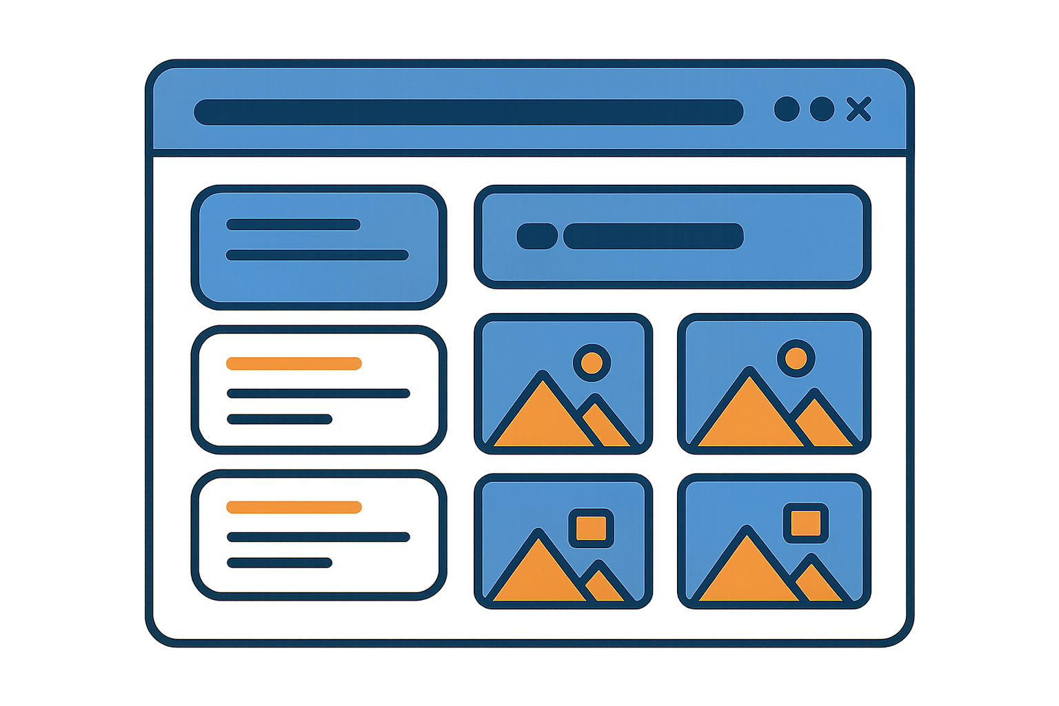
Portfolio Anatomy — The Essential Pages
Every effective design portfolio has the same core pages. You can dress them up, rename them, rearrange them — but skip any of these and you're leaving gaps that hiring managers will notice.
Portfolio Site Map
yourname.com/
├── Home — Tagline + project thumbnails + clear CTA
├── About — Who you are, how you work, what you care about
├── Case Studies (3-5 projects)
├── /project-1 — Full case study with process + outcomes
├── /project-2 — Different problem type or industry
└── /project-3 — Shows range or depth
├── Resume — Optional page or downloadable PDF
└── Contact — Email, LinkedIn, calendar link
Home Page
Your home page is a billboard, not a biography. It needs to communicate what you do in one sentence and show your best work immediately. No splash screens, no abstract animations, no "welcome to my portfolio" — just your tagline, a curated grid of project thumbnails, and a way to get in touch.
The project thumbnails on your home page are doing the heaviest lifting. They're the first impression of your visual taste, your range, and whether your work is worth clicking into. Use real UI screenshots or polished mockups — not abstract illustrations or stock photos. And please, make them all the same aspect ratio. Nothing screams "I don't care about details" like a grid of mismatched thumbnail sizes.
About Page
The about page is where personality lives. Hiring managers want to know who they'd be working with — not just what tools you use. Talk about your design philosophy, your background, what problems excite you. Mention your process briefly. Include a photo of yourself (yes, really — it makes you human).
Skip the laundry list of software skills. Nobody cares that you know Figma — everyone knows Figma. Instead, talk about what makes your perspective different. Did you come from a non-traditional background? Do you specialize in a particular domain? Are you passionate about accessibility or data-informed design? That's the interesting stuff.
Case Study Pages
This is where the real work lives. Each case study is its own page with a clear narrative arc: problem, process, solution, outcome. We'll cover this in depth in the next section, but the key is that every case study should be a story about a problem you solved — not a timeline of things you did.
Contact Page
Make it absurdly easy to reach you. Email address (not a contact form that might break), LinkedIn profile, and optionally a Calendly link for scheduling chats. If someone wants to hire you and they can't figure out how to reach you within 5 seconds, that's on you.
Case Studies That Get You Hired
If your portfolio is the evidence, your case studies are the testimony. This is where you prove you can think, not just push pixels. A good case study takes a hiring manager on a journey: here's the problem, here's how I thought about it, here's what I tried, here's what worked, and here's the impact.
Most designers get this wrong in one of two ways. Either they dump a gallery of final screens with no context (the "art gallery" approach), or they write a 5,000-word essay that reads like a thesis paper. Neither works. The goal is to show your decision-making process in a way that's visual, scannable, and compelling.
The Case Study Arc
1. Hook
Problem statement + outcome teaser
2. Context
Your role, constraints, team
3. Process
Research, ideation, decisions
4. Solution
Final designs + rationale
5. Impact
Metrics, learnings, next steps
Lead with the outcome. Don't make hiring managers scroll through three pages of process before they find out what happened. Put the result in the first paragraph — "Redesigned the onboarding flow, increasing activation by 34%" — then tell the story of how you got there. Don't have hard metrics? That's more common than you'd think — our guide on writing case studies without metrics covers what to do instead.
Show the messy middle.Polished final screens are expected. What's actually interesting is the stuff in between — the sketches, the alternative approaches you explored and rejected, the usability test where users completely ignored your clever navigation. That's the thinking that hiring managers want to see.
Be specific about your role."I designed the user interface" tells me nothing. "I led the interaction design for the checkout flow, collaborating with two engineers and a PM to ship in 6 weeks" — that tells me exactly what you did and how you work.
For a deep dive into structuring case studies that actually work, check out our case study structure guide. Or if you're starting from scratch, our Case Study Builder walks you through each section with AI assistance.
Writing Your Tagline
Your tagline is the first text anyone reads on your portfolio. It sits at the top of your home page, and it has about 3 seconds to tell someone what you do and why they should care. No pressure.
The most common mistake is being too vague. "I create meaningful digital experiences" means absolutely nothing. What kind of experiences? For whom? What makes them meaningful? Compare that to "Product designer specializing in fintech apps that simplify complex financial decisions." One is filler. The other is a signal.
Tagline formula that works:
[Role] + [specialization or domain] + [outcome or value]
Good: "UX designer helping healthcare teams build tools patients actually trust"
Good: "Product designer focused on mobile commerce — making checkout feel effortless"
Bad: "Creative thinker passionate about crafting beautiful digital journeys"
Bad: "Designer. Developer. Dreamer."
A good tagline does two things: it qualifies you and it filters the audience. When a fintech recruiter reads "product designer specializing in fintech," they immediately know you're relevant. And a gaming company knows you're probably not a fit. That's a feature, not a bug — you want the right people clicking deeper.
Need help crafting yours? Try our portfolio tagline generator or browse real tagline examples for inspiration.
Design & Layout
Your portfolio's design is a meta-test. It's your work about your work. If you're applying for design jobs and your portfolio has alignment issues, inconsistent spacing, or a confusing navigation, that tells hiring managers more than any case study ever could.
That said, the best portfolio layouts tend to be the simplest. You're not designing a portfolio to win design awards (though that'd be nice). You're designing it to make your work easy to find, easy to understand, and pleasant to browse.
Layout principles that work:
- •Clear hierarchy — Headings, subheadings, and body text should have obvious size and weight differences
- •Generous white space — Let your work breathe. Cramped layouts feel desperate
- •Consistent grid — Pick a grid and stick with it across every page
- •Readable typography — 16px minimum for body text, 1.5-1.7 line height, max 65-75 characters per line. Not sure which fonts to use? Try our Font Pairing tool
- •Thoughtful color — Use color sparingly and intentionally. Your portfolio should frame your work, not compete with it
Navigation matters more than you think.Can someone get from any page to any other page in one click? Is the navigation visible on mobile? Are the labels clear? "Work" is better than "Playground." "About" is better than "The Human." Save creativity for your projects, not your nav labels.
Mobile is not optional.A significant portion of initial portfolio views happen on phones — recruiters checking LinkedIn on their commute, hiring managers forwarding links in Slack. If your portfolio breaks on a 375px screen, you're losing opportunities you never knew existed.
Explore more on portfolio layout examples, navigation best practices, and mobile portfolio design.
Platform Choices
The platform you use to build your portfolio matters less than you think — but the tradeoffs are real. The right choice depends on your technical comfort, budget, need for customization, and how much time you want to spend on maintenance vs. design.
| Platform | Best For | Tradeoff | Cost |
|---|---|---|---|
| Webflow | Design-focused customization without code | Steeper learning curve | $14-39/mo |
| Framer | Interactive prototypes and animations | Newer platform, smaller community | Free-$20/mo |
| Squarespace | Quick setup with polished templates | Limited customization | $16-33/mo |
| Custom Code | Full control, unique differentiation | Time-intensive, requires dev skills | $0-20/mo (hosting) |
| Read.cv / Notion | Quick portfolio for job searching | Minimal design control | Free |
Here's my honest take: if you're a UX or product designer, use whatever lets you ship fastest. Spending three months building a custom React portfolio is three months you're not job hunting. Webflow or Framer gives you enough design control to create something polished and unique in a weekend.
If you're a front-end designer or design engineer, a custom-coded portfolio can be a differentiator — it shows you can actually build what you design. But it's not required, and it's not expected for most design roles.
One thing that does matter: use your own domain name. yourname.com looks professional. yourname.webflow.io does not. A custom domain costs $12-15 per year and immediately signals that you take your career seriously.
For detailed comparisons, check out our portfolio platform comparison. If you've already picked a tool, jump to our Webflow portfolio setup guide or Framer portfolio tutorial.
SEO for Portfolios
SEO for portfolios isn't about ranking #1 for "UX designer." It's about making sure that when someone Googles your name, your portfolio shows up first — not your old Behance page from 2019 with three followers.
Beyond name-based search, basic SEO helps your case studies get found by recruiters searching for specific skills or industries. "Fintech UX designer San Francisco" or "healthcare product design portfolio" — these are real searches that real recruiters make. If your portfolio is properly optimized, you show up. If it's not, you don't.
Portfolio SEO essentials:
- •Title tags — Every page should have a unique, descriptive title. "E-commerce Checkout Redesign | Jane Smith, Product Designer"
- •Meta descriptions — Write a compelling 150-character summary for each case study
- •Image alt text — Describe every design screenshot. "Mobile checkout screen showing simplified payment form"
- •Page speed — Compress images, lazy-load below the fold. If your portfolio takes 5 seconds to load, Google (and humans) will bail
- •Semantic headings — Use proper H1/H2/H3 hierarchy, not just styled text that looks like headings
One often-missed tip: add real text to your case studies. Google can't read text inside images. If your entire case study is a series of Figma mockup screenshots with no written context, search engines have nothing to index. Write the story in actual HTML text, then use images to support and illustrate.
For a full walkthrough, use our portfolio SEO checklist.
Accessibility
If you list "accessibility" as a skill on your resume and your own portfolio fails basic WCAG guidelines, you have a credibility problem. Beyond ethics and legal requirements, accessible portfolios simply work better for everyone — including hiring managers reading on low-brightness screens, using screen magnifiers, or navigating with a keyboard.
The good news is that portfolio accessibility isn't complicated. You don't need to become a WCAG expert. You just need to get the fundamentals right.
Portfolio accessibility checklist:
- •Color contrast — 4.5:1 ratio minimum for body text, 3:1 for large text and UI elements
- •Keyboard navigation — Can you tab through every link and button in logical order?
- •Alt text on images — Every design screenshot needs a meaningful description
- •Focus indicators — Visible focus states on interactive elements (don't remove outlines)
- •Semantic HTML — Use proper heading levels, landmarks, and link text ("Read case study" not "Click here")
- •Responsive text — Text should scale when users increase browser font size
Here's a quick test: navigate your entire portfolio using only your keyboard. Tab key to move forward, Shift+Tab to go back, Enter to activate links. If you get stuck, can't see where you are, or can't reach something — that's a problem real users will hit too.
For a thorough deep-dive, read our accessibility for portfolios guide.
Portfolio Examples
Studying other designers' portfolios is one of the fastest ways to improve your own — as long as you're studying the right things. Don't just look at the visual design. Pay attention to structure, storytelling, navigation patterns, and how they present their process.
When browsing portfolio examples, ask yourself these questions:
What to look for in portfolio examples:
- •First impression — What do you understand about this person within 5 seconds of landing?
- •Case study depth — How do they balance visuals with narrative? What's the ratio of images to text?
- •Navigation — How easy is it to move between projects and pages?
- •Personality — Does this portfolio feel like a person made it, or could it be any designer on earth?
- •Mobile experience — Pull it up on your phone. Does it actually work?
One trap to avoid: don't mistake admiration for imitation. Seeing a portfolio with beautiful scroll-triggered animations doesn't mean yours needs them too. What works for a motion designer's portfolio would be distracting on a UX researcher's. Take principles, not pixels.
Browse our curated collections in the portfolio examples gallery and portfolio project examples for specific inspiration.
Getting Feedback
You've been staring at your portfolio for weeks. You know every pixel, every word, every hover state. That familiarity is exactly why you need someone else to look at it before you ship it. You literally cannot see your own blind spots anymore.
The best portfolio feedback comes from people who understand design hiring. That could be a design lead at a company you respect, a mentor, or a peer who's recently been through the hiring process. Ask them specific questions: "Can you tell what I specialize in from the home page?" "Is this case study too long?" "What would you want to know more about?"
Vague requests ("what do you think?") get vague responses ("looks good!"). Direct questions get useful answers. Frame what kind of feedback you need and where you feel uncertain.
If you don't have access to a design mentor or senior designer, AI-powered critique tools can fill the gap. They won't replace the nuance of a human reviewer, but they can catch structural problems, accessibility issues, and visual inconsistencies faster than any person.
Get instant, honest feedback on your portfolio
Upload your portfolio and get specific, actionable critique in seconds. No scheduling, no politics, no pulled punches.
Try The Crit FreeWant to understand more about how design critique works and how to get the most from it? Read our complete guide to design critique.
Common Mistakes
After reviewing hundreds of design portfolios, the same mistakes keep showing up. Some are easy fixes. Others require rethinking your entire approach. Here are the ones that cost designers the most opportunities.
| Mistake | Why It Hurts | The Fix |
|---|---|---|
| Too many projects | Dilutes your strongest work with mediocre stuff | Curate ruthlessly. 3-5 strong projects only |
| No process shown | Makes it look like designs appeared from nowhere | Show the messy middle — sketches, iterations, decisions |
| Vague role description | Hiring managers can't tell what you actually did | Be specific: "Led interaction design for checkout flow" |
| Slow load time | People leave before seeing your work | Compress images, lazy-load, test on 3G |
| No outcomes or metrics | Your work looks decorative, not impactful | Add results even if qualitative: "reduced support tickets by 40%" |
| Broken on mobile | Recruiters check portfolios on phones constantly | Test on real devices, not just browser resize |
| Password-protected | Adds friction — many reviewers won't bother | Only use for NDA work. Everything else should be public |
The biggest mistake of all?Waiting until your portfolio is "perfect" to publish it. Perfectionism kills more portfolios than bad design ever could. Ship it at 80%, get feedback, iterate. A live portfolio with room for improvement beats a "coming soon" page every single time.
For an expanded list with visual examples, check our design mistakes guide.
The Bottom Line
Building a design portfolio isn't a one-time project — it's an ongoing practice. Your portfolio should evolve as you grow, reflecting your current skills and thinking, not the work you did three years ago. The designers who land the best roles aren't necessarily the most talented ones. They're the ones who communicate their talent most clearly.
Start with structure. Nail your case studies. Make it fast, accessible, and easy to navigate. Then put it in front of people who will give you honest feedback. Rinse and repeat.
Your portfolio is the only thing standing between you and your next opportunity. Make it count. And if you're not sure whether it's working, well — that's what we're here for.
Ready to level up your portfolio?
Upload your portfolio and get specific, actionable feedback in seconds. No scheduling, no politics, no pulled punches.
Try The Crit FreeEverything You Need to Know
Quick answers to help you get started
Share this resource

Written by
Nikki KippleProduct Designer & UX Strategist
Designer, educator, founder of The Crit. I've spent years teaching interaction design and reviewing hundreds of student portfolios. Good feedback shouldn't require being enrolled in my class — so I built a tool that gives it to everyone. Connect on LinkedIn →
Too close to your own work?
Send one screen, case study, or URL. We'll show what's working, what's getting skipped, and what to fix next.
Continue Reading
All resources →Get one actionable portfolio tip every week. No fluff.
Short reads you can use on your site. Unsubscribe anytime.