Case Study Structure Guide
Master case study writing with proven templates, real examples, and industry-specific variations. Create compelling case studies that hiring managers actually read and remember.
⚡ TL;DR
- Open strong: Start with problem + stakes in 2-3 sentences
- Show thinking: Include trade-offs, iterations, and dead-ends
- Prove impact: End with measurable outcomes and lessons learned
- Keep it scannable: Use headers, bullets, and visual hierarchy
Making Case Studies Interesting
Hiring managers skim case studies in about 6 seconds. If yours starts with "I redesigned the homepage and users loved it," you've already lost them. Let's give them a reason to slow down.
The Hard Truth
After reviewing portfolios and talking to hiring managers, here's what usually happens (use our portfolio checklist tool to see where yours stands, or start with our UX portfolio guide for beginners):
- •Most case studies get 6 seconds before they're skipped
- •Hiring managers scan for results first, process second
- •Specific metrics beat vague "improved user experience" every time
The Only Structure That Matters
Problem
What needs fixing?
Process
Show your thinking
Solution
What you built
Results
Prove the impact
Learnings
What you'd do differently
What Actually Hooks Readers
- •Stakes: Start with what happens if this problem isn't solved
- •Struggle: Show the part where you got stuck or went down dead ends
- •Trade-offs: Explain what you gave up and why
- •Numbers: Specific metrics, not "users loved it"
- •Failures: What didn't work and what you learned
The Reality Check
What Everyone Writes
"The homepage had usability issues. I redesigned it and improved the user experience. Users were happy with the results."
Generic. Could be anyone's project.
What Gets You Hired
"Checkout abandonment hit 73%. Revenue was bleeding $2M annually. My redesign reduced abandonment to 31% in 8 weeks—but here's what almost killed the project..."
Stakes. Numbers. Drama. Now I'm reading.
If your case study gets skimmed, structure is probably the issue.
Send one case study or draft. We'll show where the story loses people and what to tighten first.
5-Part Structure That Works
Stop reinventing the wheel. This structure works because it matches how hiring managers think.
📋 Works in Any Format
This isn't about where you build your case study. The 5-part structure works whether you're creating:
- • Figma presentation file
- • Notion case study page
- • Video walkthrough
- • PDF portfolio
- • Live website showcase
- • Slide deck presentation
- • Interactive prototype
- • Written blog post
The format doesn't matter. The story structure does.
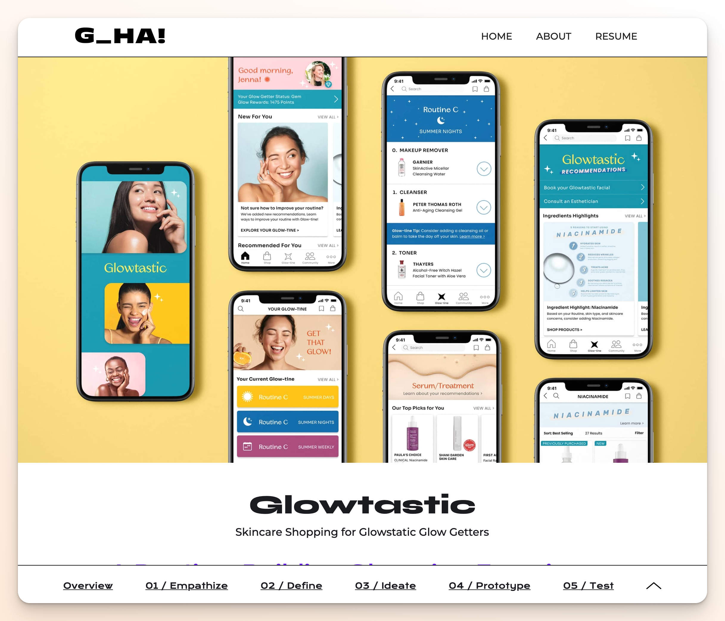
Format-agnostic structure: same compelling narrative framework works across any presentation style. Portfolio by Gloria Ha (glorialo.design)
1. Problem (The Hook)
Start with stakes. What breaks if this isn't solved?
"Checkout abandonment hit 73%. We were losing $2M annually. Customers were frustrated, sales was panicking, and I had 8 weeks to fix it."
Stakes + timeline + personal pressure = hooked reader
2. Process (Your Thinking)
Show the messy middle. Include dead ends and breakthroughs.
"I started with user research but hit a wall—users said one thing, data showed another. Then I noticed something weird in the heat maps..."
Struggle + discovery moment = credible expertise
3. Solution (What You Built)
Show, don't just tell. Include the rationale behind key decisions.
"The new flow reduced steps from 7 to 3, but the breakthrough was moving the price breakdown above the fold—something our A/B tests proved was crucial."
Specific changes + validation method = trustworthy solution
4. Results (Prove Impact)
Numbers, not feelings. Before/after with context.
"Abandonment dropped from 73% to 31% in 8 weeks. Revenue recovered $1.4M in the first quarter. But the real win was reducing support tickets by 60%."
Primary metric + business impact + bonus insight = complete picture
5. Learnings (What You'd Do Different)
Show growth. What would you change? What surprised you?
"I should have involved customer service earlier—they had insights I missed. Also, mobile behavior was completely different from desktop, something I'd test from day one next time."
Self-awareness + future application = mature designer
Copy-Paste Templates
Pick your situation, fill in the blanks, customize.
Template 1: High-Stakes Redesign
[Metric] had issues. [Specific impact on business].
I had [timeline] to [goal], but [major constraint/challenge].
My research revealed [unexpected insight]. This changed everything.
The solution: [key changes with rationale].
Results: [before] → [after] in [timeframe]. [Business impact].
What I'd do differently: [learning/improvement].
Template 2: New Feature Launch
Users kept asking for [feature], but [why it was complex].
The challenge: [technical/user/business constraint].
After [research method], I discovered [key insight about user behavior].
My approach: [solution strategy]. Here's why [rationale].
Launch results: [adoption rate] in [timeframe]. [User feedback metric].
Next time I'd: [specific improvement based on results].
Common Mistakes
These are the case study issues that make hiring managers lose interest. For more portfolio pitfalls to avoid, see our comprehensive design mistakes guide.
1. Starting with process instead of problem
Nobody cares about your design process until they care about the problem. Hook first, methodology second.
2. "Users loved it" without data
Prove it. Numbers, metrics, before/after comparisons. Feelings don't hire you.
3. Perfect linear story
Real projects are messy. Show the struggle, dead ends, and pivots. That's where expertise shows.
4. All visuals, no story
Pretty screenshots don't explain your thinking. Balance visuals with narrative.
5. No business context
Design doesn't exist in a vacuum. Show how your work connects to business goals.
Make It Scannable
Your compelling story is pointless if hiring managers can't scan it in 30 seconds.
⚡ Reality Check
- • Recruiters skim case studies in under 6 seconds
- • 73% of portfolios are reviewed on mobile during commutes
- • Generic project titles get skipped immediately
- • Your compelling story is useless if the format is unreadable
Title Formula That Gets Read
❌ Skippable Title
"E-commerce Mobile App"
Could be anyone's project. No hook. Gets skipped.
✅ Scannable Title
"Redesigned checkout → 73% to 23% abandonment"
Action + specific result = instant interest
📝 Title Formula
[Action Verb] + [Feature/System] → [Specific Result]
Senior Examples:
• "Redesigned onboarding → 3x user activation"
• "Fixed search → 89% fewer support tickets"
Junior Examples:
• "Improved accessibility → 5/6 tasks now pass"
• "Streamlined signup → 2 min to 30 seconds"
Student Examples:
• "Tested recipe app → 6/6 users found feature"
• "Redesigned form → 30% to 90% completion"
Mobile Reality
Most hiring managers look at portfolios on their phone first while multitasking or in transit. Hiring managers also test portfolio responsiveness even when viewing on desktop. If your case study doesn't work on mobile, you signal you're not serious about your craft.
Mobile Case Study Checklist:
- • Title readable without zooming
- • Key metrics visible above the fold
- • Images load fast (under 3 seconds)
- • Text contrast passes WCAG AA (4.5:1 ratio) — see our typography principles guide for detailed contrast guidelines
- • Tappable areas at least 44px
- • Works offline or with slow connection
🔄 Framework Evolution
Industry is moving toward simpler structures. Here's what works now:
5-Part (Traditional)
Problem → Process → Solution → Results → Learnings
Good for: Portfolio school projects, detailed documentation
PCR (Modern)
Problem → Change → Retrospective
Good for: Professional work, hiring manager scanning
Use 5-part for learning, PCR for landing jobs. Both need compelling openings and scannable titles.
Industry-Specific Case Study Formats
The 5-part structure works everywhere, but different industries emphasize different elements. Here's how to adapt your case studies for maximum impact in specific fields.
Tech/SaaS Case Studies
Focus: Metrics, user behavior data, A/B test results, technical constraints
Emphasize:
- • User testing data and validation methods
- • Conversion rates, engagement metrics, retention
- • Technical feasibility and development constraints
- • Scalability considerations for growth
- • Integration with existing systems
Structure Adaptation:
- • Lead with business impact metrics
- • Include technical research methodology
- • Show iterative testing cycles
- • Document edge cases and error states
- • End with long-term performance data
E-commerce Case Studies
Focus: Conversion optimization, user journey mapping, mobile experience, checkout flow
Key Elements:
- • Cart abandonment rates and recovery strategies
- • Mobile vs desktop performance differences
- • Payment security and trust indicators
- • Product discovery and search functionality
- • Cross-selling and upselling opportunities
Success Metrics:
- • Revenue per visitor improvement
- • Checkout completion rates
- • Average order value increases
- • Customer lifetime value impact
- • Return customer behavior
Healthcare & Fintech Case Studies
Focus: Compliance, accessibility, security, trust building, error prevention
Critical Considerations:
- • HIPAA/GDPR compliance requirements
- • Accessibility standards (WCAG AA minimum)
- • Error prevention and recovery flows
- • Multi-factor authentication UX
- • Clear communication of complex information
Trust Indicators:
- • Security messaging and visual cues
- • Plain language explanations
- • Progressive disclosure of information
- • Confirmation and verification steps
- • Professional design aesthetics
Agency & Client Work Case Studies
Focus: Client collaboration, brand alignment, timeline management, stakeholder buy-in
Process Highlights:
- • Client briefing and requirements gathering
- • Stakeholder workshops and alignment sessions
- • Brand guideline integration and evolution
- • Feedback loops and revision cycles
- • Launch strategy and rollout planning
Client Success Indicators:
- • Client satisfaction and testimonials
- • Project timeline and budget adherence
- • Long-term client relationships
- • Award recognition or industry features
- • Referral business generated
💡 Adaptation Strategy
Don't completely rewrite your case studies for every application. Instead, create a master version using the 5-part structure, then emphasize different elements based on the role and company you're applying to.
For Product Roles:
Lead with business impact and user research
For Visual Roles:
Showcase design process and visual evolution
For UX Roles:
Emphasize user research and testing methodology
Before/After Examples
Real case study openings that work at every level. Compelling isn't about big numbers—it's about being specific and showing real impact.
🎯 The Disconnect
Even great portfolios often miss the compelling hook. Most case studies we admire are professionally designed but don't grab attention in the first 6 seconds.
What Most Portfolios Do
Clean design + professional presentation + generic opening = gets skipped
What Gets You Hired
Clean design + professional presentation + compelling hook = gets read
The difference is subtle but critical. Most designers nail the design, miss the story. Don't be most designers.
Senior Designer
❌ Generic Opening
E-commerce Redesign Project
"For this project, I was tasked with redesigning the checkout flow to improve user experience. I conducted user research, created wireframes, and tested prototypes. The final design improved usability metrics."
Could be anyone's project. No stakes, no urgency.
✅ Compelling Opening
E-commerce Redesign Project
"Checkout abandonment hit 73%. We were bleeding $2M annually in lost revenue. Customers called support daily about payment errors, and our CEO threatened to shut down online sales entirely. I had 8 weeks to fix it."
Stakes + timeline + pressure = hooked reader.
Junior Designer
❌ Generic Opening
Dashboard Accessibility Project
"I was asked to improve the accessibility of our internal dashboard. I researched WCAG guidelines and made updates to colors and navigation. The changes improved compliance."
Vague improvements. No human impact shown.
✅ Compelling Opening
Dashboard Accessibility Project
"Our customer service team couldn't use the dashboard with screen readers. Sarah, who's been here 8 years, had to ask colleagues to read her daily reports. When tested, users with visual impairments gave up on 5 out of 6 key tasks."
Human impact + specific testing data = compelling story.
Student/Bootcamp Project
❌ Generic Opening
Recipe App Design
"For my bootcamp capstone, I designed a recipe app. I conducted user interviews, created wireframes, and built prototypes. Testing showed the design was intuitive and users liked it."
Generic process description. No specific outcomes.
✅ Compelling Opening
Recipe App Design
"In initial testing, 4 out of 6 users couldn't find the ingredient substitutions feature—the core value prop. One said 'I'd rather just Google recipes than fight this app.' Task completion dropped to 30% when users tried to save modified recipes."
Specific user behavior + direct quotes = real evidence.
Real Portfolio Example
⚠️ Common Approach (Good Design, Missing Hook)
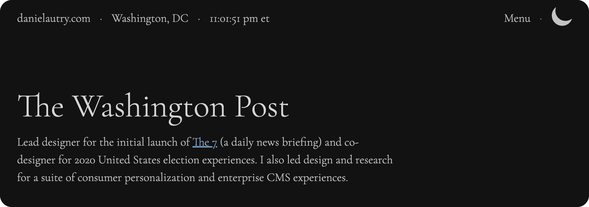
Daniel's Google case study: Strong example of professional presentation with clear problem framing. View full case study at danielautry.com/google
What Works Here:
- • Clear problem statement: "Simplifying news consumption for users"
- • Company context: Google brand immediately establishes credibility
- • Structured approach: Research → Design → Validation flow visible upfront
Could Be Stronger:
- • Specific stakes: How many users affected? What's the business impact?
- • Urgency factor: Why tackle this problem now vs. later?
- • Human story: Real user quotes or pain points to create empathy
This is stronger than most portfolios—the Google context and clear problem help. Adding specific metrics and human impact would make it irresistible.
💡 The Pattern
Notice how compelling examples share these elements:
Specific Data
- • 73% abandonment rate
- • 5 out of 6 tasks failed
- • 4 out of 6 users couldn't find it
Human Impact
- • "Sarah had to ask colleagues"
- • "I'd rather just Google"
- • "Called support daily"
Stakes/Urgency
- • "8 weeks to fix it"
- • "CEO threatened to shut down"
- • "Bleeding $2M annually"
Tools & Resources
Everything you need to build compelling case studies that actually get read. If you want a guided walkthrough, our Case Study Builder walks you through each section step-by-step with AI assistance.
Use whatever format works for you. The structure matters more than the platform.
Content & Presentation
Free workspace for organizing case study content
Create process diagrams and visual documentation
Pre-built templates for structuring case study layouts
Data & Analytics
Track user behavior and conversion metrics
Heatmaps and user session recordings
Portfolio Critique
Submit your case studies for honest feedback. We'll tell you what hiring managers actually think when they read them. Try a single page free.
Get Your Case Studies Reviewed →Everything You Need to Know
Quick answers to help you get started
Share this resource

Written by
Nikki KipplePortfolio Designer & Strategist
Designer, educator, founder of The Crit. I've spent years teaching interaction design and reviewing hundreds of student portfolios. Good feedback shouldn't require being enrolled in my class — so I built a tool that gives it to everyone. Connect on LinkedIn →
Your case study may be doing too much work in the wrong places.
Send one case study or draft. We'll show what gets skipped, where the story is unclear, and what to tighten first.
Continue Reading
All resources →Get one actionable portfolio tip every week. No fluff.
Short reads you can use on your site. Unsubscribe anytime.