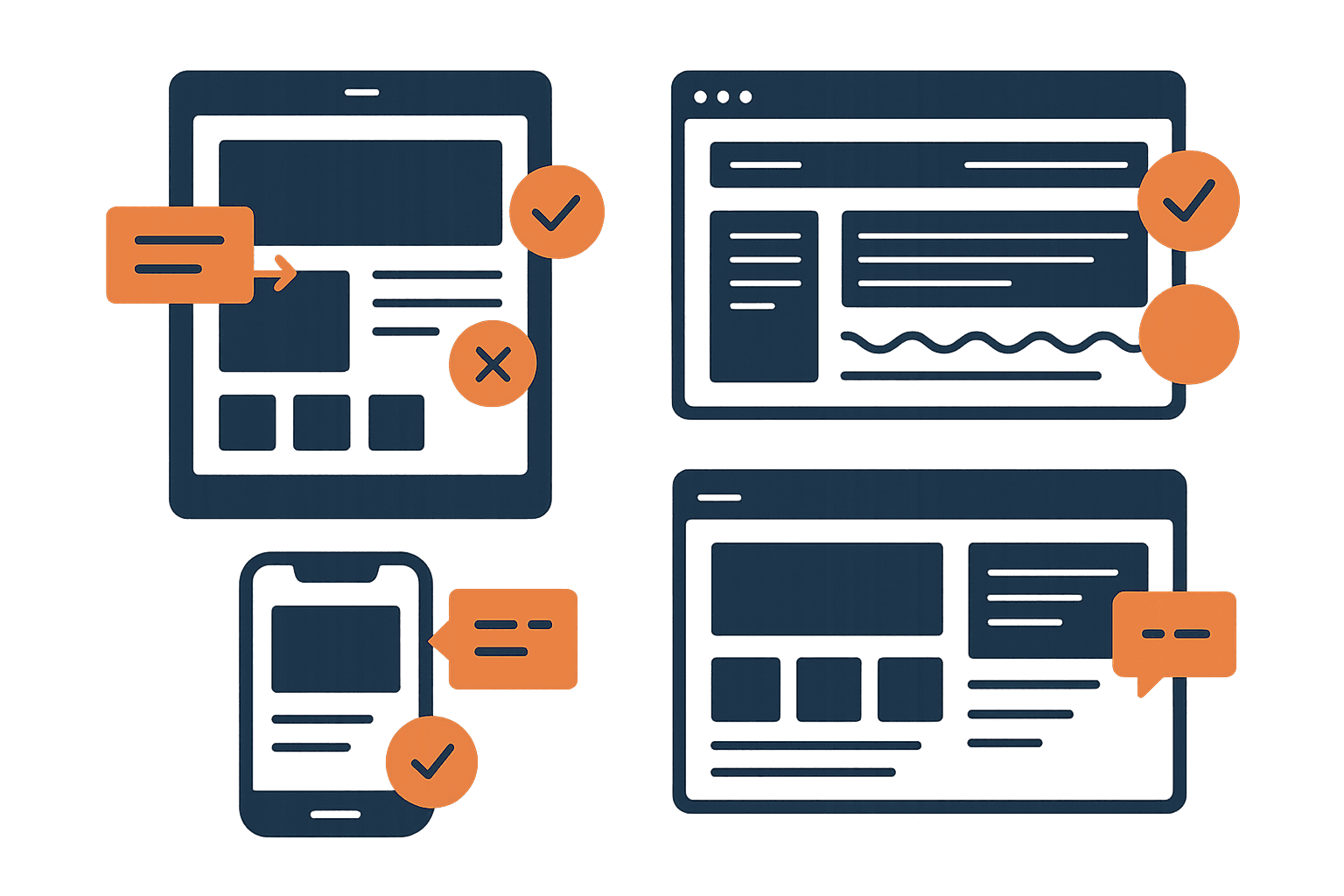
The Frankenstein Problem
You've spent months perfecting your site. The typography is dialed in. The colors are consistent. The spacing feels intentional. Then you drop in a third-party popup tool and suddenly there's a completely different design language screaming over your carefully crafted experience.
Different fonts. Different button styles. Different border radius. A color palette that came from the popup tool's default template, not your brand. It looks bolted on — because it was.
Users notice this instantly. Not consciously — they don't think “hmm, that border radius doesn't match.” They just feel it. Something's off. The popup doesn't feel like it belongs. And in 2026, anything that doesn't feel native feels like spam.
This is the Frankenstein problem: when your popup looks like it was stitched together from a different website, users treat it like an intruder. They close it, block it, or worse — they lose trust in your entire site.
The 3-Second Trust Test
When a popup appears, users make a snap judgment: is this part of the site, or is this an ad?
That judgment happens in about 3 seconds. And it's almost entirely visual. Users aren't reading your headline yet. They're pattern-matching against the design they've already absorbed from your page.
The visual cues users check (in order):
- 1.Color palette — Does this match the site I'm on?
- 2.Typography — Same fonts, or suddenly something different?
- 3.Shape language — Rounded corners vs sharp edges, consistent with the page?
- 4.Spacing and density — Does the popup breathe the same way as the site?
- 5.Shadow and elevation — Does the depth model match?
Miss even one of these and the popup triggers the user's “this isn't real” instinct. Match all five and the popup feels like a natural part of the experience — something the site is saying to them, not something being done to them.
Your Site's Visual DNA
Every well-designed site has a visual DNA — a set of design tokens that make it feel cohesive. Your popup needs to inherit this DNA completely. Not “close enough.” Exactly.
🎨 Colors
Your popup's background, text, buttons, and accents should use the exact same hex values as your site. Not “a similar blue” — the same blue. Pull your primary, secondary, and neutral colors directly from your stylesheet or design tokens. If your CTA buttons are #FF6D0C on the site, they're #FF6D0C in the popup.
🔤 Typography
This is where most popups fail immediately. The site uses Inter? The popup uses Inter — not the popup tool's default system font. Same weight hierarchy: if your site uses 700 for headings and 400 for body, your popup does too. Font size should scale proportionally to the rest of your UI.
📐 Border Radius
This one's subtle but powerful. If your site uses 8px radius on cards and buttons, your popup container should use the same — or a proportionally larger value (like 12px or 16px for a larger element). Sharp corners on a rounded site, or pill shapes on a geometric site, immediately look wrong.
📏 Spacing
Your site probably uses a spacing scale — 4px, 8px, 16px, 24px, 32px. Your popup should use the same scale. If your site's cards have 24px padding, your popup has 24px padding. Consistent spacing is what makes something feel “designed” vs “template.”
🌑 Shadows & Elevation
If your site uses soft, diffused shadows (0 4px 24px rgba(0,0,0,0.08)), your popup should float with the same shadow language. Hard drop shadows on a soft-shadow site scream “third-party tool.” Match the blur, spread, and opacity of your existing elevation system.
The Consistency Checklist
Before shipping any popup, run it through this checklist. Every “no” is a trust leak.
Background color matches your site's card/surface color
Text uses your site's exact font family and weights
CTA button uses your site's primary action color and style
Border radius matches your site's shape language
Padding/spacing follows your site's grid system
Shadow/elevation matches your site's depth model
Close button style is consistent with your UI patterns
Input fields match your site's form styling
Imagery style is consistent (illustrations, photos, icons)
Animation style matches (ease, duration, spring constants)
Score yourself honestly. 8/10 or above and your popup will feel native. Below that, you're losing conversions to visual distrust.
When to Show (and When Not To)
Visual consistency gets you past the trust test. But timing determines whether users are even in the mood to engage. NNGroup research found that users encounter an average of 25 popups per week — they're not patient.
On page load
The user hasn't seen your content yet. You're interrupting before they've decided if they care. Google also penalizes this on mobile.
During a critical task
Mid-checkout, mid-form, mid-article reading. Any interruption during focused work feels hostile.
Multiple popups in sequence
Cookie consent → newsletter → chat widget → discount offer. Each one erodes trust exponentially.
Exit intent
User is already leaving — a well-timed offer is a last chance, not an interruption. Converts at 2-4% on average.
After scroll depth (50-70%)
Proves the user is engaged with your content. They've invested attention — now an offer feels relevant.
After meaningful interaction
Completing a quiz, using a tool, reaching the end of an article. The user has gotten value — reciprocity kicks in.
Time delay (30-60 seconds)
Simple but effective. Anyone still on the page after a minute is genuinely interested.
Anatomy of a Trusted Modal
The best-converting modals share a consistent structure. Here's the pattern:
1. Backdrop
Semi-transparent overlay (usually rgba(0,0,0,0.5)) that dims the page content without hiding it completely. Click-to-dismiss on the backdrop, but always with an explicit close button too.
2. Container
Centered, max-width constrained (400-560px for single-column, up to 720px with imagery). Uses your site's card styling — same background, radius, shadow, padding.
3. Close button
Top-right, always visible, keyboard-accessible. Don't hide it, don't make it tiny, don't delay it. Users who feel trapped don't convert — they leave your site entirely.
4. Headline
One clear value proposition. Not “Subscribe to our newsletter” — that's what you want. What does the user get? “Get design tips that actually work” is better.
5. Supporting text
One or two sentences max. Specifics beat vague promises: “Weekly teardowns of real portfolios” beats “Stay up to date.”
6. Action
One primary CTA. If you need a form, keep it to email only — every additional field drops conversion ~10%. Button text should be specific: “Send me the tips” converts better than “Submit.”
Common Mistakes
These are the patterns we see most often in design critiques — and they all kill conversions:
Using the popup tool's default template
Mailchimp's default popup looks like Mailchimp — not like your site. Always customize colors, fonts, and spacing to match your brand completely.
Stock photography that clashes
If your site uses illustrations, don't put a stock photo in the popup. If your site is minimal, don't make the popup image-heavy. The visual language needs to match.
Aggressive countdown timers
Fake urgency on a popup screams scam. If you have a real deadline, show it. If you don't, the countdown destroys credibility.
Guilt-trip dismiss copy
“No thanks, I don't want to improve my designs.” This felt clever in 2018. In 2026 it just feels manipulative. A simple “No thanks” or an X button is cleaner and more respectful.
Forgetting mobile
A popup designed for desktop that squishes on mobile, with tiny close buttons and overflowing text. Test at 375px wide — if the close button is hard to tap, you've already lost.
Before & After
The difference between a popup that converts and one that gets closed is rarely the offer — it's the execution. Here's what changes when you apply visual consistency:
❌ Before (Generic Popup Tool Default)
- • System font (Arial/Helvetica) on a site using custom typography
- • Bright blue CTA on an orange-branded site
- • Sharp 4px radius on a site with 12px rounded corners
- • Tight, cramped spacing vs the site's generous whitespace
- • Hard drop shadow on a site using soft elevation
Result: 0.5% conversion, 89% immediate close rate
✅ After (Matching Site Visual DNA)
- • Same font family, weights, and size scale as the site
- • Primary brand color on the CTA, matching the site's buttons
- • 12px radius matching the site's card components
- • 24px padding following the site's spacing grid
- • Soft shadow matching the site's elevation system
Result: 3.2% conversion, 52% immediate close rate
Same offer, same headline, same timing. The only difference is visual consistency. That's a 6x improvement in conversion from design changes alone.
The Bottom Line
Your popup is part of your product. Treat it that way.
Pull your design tokens — colors, fonts, spacing, radius, shadows — and apply them to every overlay, modal, and dialog on your site. Test it with the 3-second trust test: show the popup to someone unfamiliar with your site and ask “does this look like it belongs?”
If the answer is anything other than an immediate yes, keep matching until it does. The conversion lift is worth it.
Everything You Need to Know
Quick answers to help you get started
Stay in the Loop Design Updates
Get practical design tips and new updates. No spam, unsubscribe anytime.