Typography for Portfolio Design Make Your Work Speak Before They Read
How to choose, pair, and scale typography for your design portfolio. Type systems, case study typography, dark mode, mobile, and the 7 most common portfolio typography mistakes.
⚡ TL;DR
- Core rule: Two to three font families max — a display face, a body face, and optionally a monospace or accent
- Why it matters: Typography is the first thing people feel on your portfolio, even before they read a word
- Biggest mistake: Treating type as decoration instead of structure — your type system IS your visual hierarchy
Typography IS Your Portfolio's First Impression
Before anyone reads your case study headline, before they look at your mockups, before they even register what your portfolio is about — they've already absorbed your typography. The spacing. The weight. The way the letters sit on the page. It happens in under a second, and it sets the tone for everything that follows.
I review a lot of portfolios. And the ones that feel "professional" before you even start reading? It's almost always the type. Not the colors, not the layout grid, not the fancy animations. The type. It's the quiet workhorse that makes everything else look better — or worse.
Think about it this way: your portfolio is mostly text. Case study narratives, project descriptions, process explanations, image captions, navigation labels. If the vessel carrying all of that content feels wrong — too tight, too light, too generic, too hard to read — then the content suffers no matter how good it is.
Good portfolio typography does three things simultaneously:
- •Establishes hierarchy — guides the eye from the most important information to the least
- •Creates atmosphere — sets a visual tone that signals who you are as a designer
- •Enables readability — makes your content effortless to consume at any length
Miss any one of those, and your portfolio has a problem that no amount of visual polish can fix. A beautiful layout with unreadable body text is still a bad experience. A perfectly readable site with zero typographic personality feels like a template. You need all three working together.
For a broader look at the principles behind effective type choices, our typography principles guide covers the fundamentals in depth.
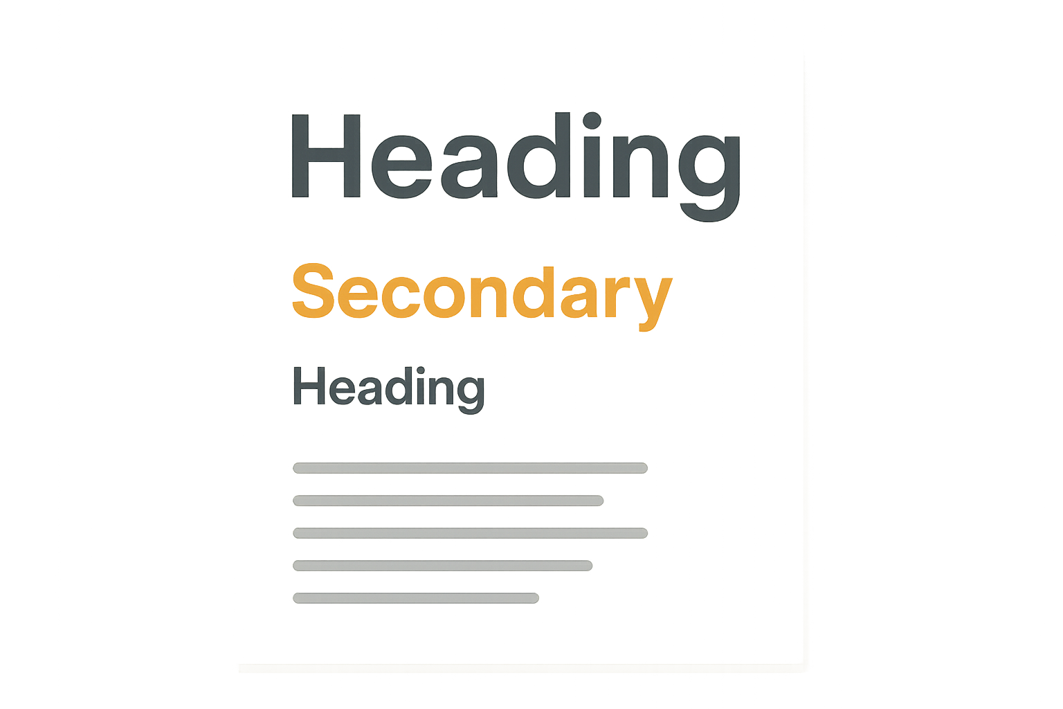
Choosing Your Type System
A type system isn't just "picking fonts." It's choosing a small set of typefaces that work together to handle every piece of text your portfolio needs to display — from giant hero headlines to tiny image captions. The goal is consistency without monotony, variety without chaos.
Most portfolio type systems need exactly three roles filled:
1. Display Face
This is your headline font — the one that carries the most personality. It shows up in hero sections, case study titles, section headers, and anywhere you need visual impact. Display faces can afford to be expressive because they're used at large sizes and in short bursts.
Good choices: Fraunces, Playfair Display, Space Grotesk, Clash Display, Cabinet Grotesk, General Sans
2. Body Face
This is where readability is everything. Your body font will carry the bulk of your content — case study narratives, project descriptions, process walkthroughs. It needs to be comfortable to read at 16–18px across long paragraphs. Personality takes a back seat to legibility here.
Good choices: Inter, DM Sans, Satoshi, Source Sans Pro, IBM Plex Sans, Libre Franklin
3. Monospace or Accent (Optional)
A third face is useful for code snippets, data labels, metadata, or small UI elements that need to feel distinct from both display and body text. This is optional — plenty of great portfolios work fine with just two families. But if you show any code, specs, or technical details, a monospace face keeps things clear.
Good choices: JetBrains Mono, Fira Code, IBM Plex Mono, Space Mono, Source Code Pro
The Two-Family Sweet Spot
Two font families is the most common setup for portfolio sites — and for good reason. One display, one body. That's enough contrast to create hierarchy while keeping things unified. The simplest version:
- •Serif + Sans-serif: The classic pairing. Serif headings feel editorial and confident; sans-serif body text stays clean and readable.
- •Geometric sans + Humanist sans: Two sans-serifs with different personalities. One structured for headlines, one warmer for body.
- •Display sans + Neutral sans: An expressive sans for impact, a quiet sans for everything else.
For 20 specific pairings you can use right now — with code you can copy — check our font pairing guide.
Type Scale for Portfolio Sites
A type scale is the set of font sizes you use across your site. Without one, you end up eyeballing sizes on every page, and things drift. With one, every heading, every paragraph, every caption has a predetermined size that keeps the whole site cohesive.
For portfolio sites, I recommend a scale based on a 1.250 ratio (major third) or a 1.333 ratio (perfect fourth). These give you enough contrast between levels without things feeling too dramatic or too compressed.
Recommended Portfolio Type Scale (1.250 ratio)
A few practical notes on this scale:
- •Line heights decrease as sizes increase. Big headlines look best tight (1.1–1.2). Body text needs breathing room (1.5–1.6). This isn't arbitrary — it's how our eyes track lines.
- •Paragraph spacing matters as much as size. Use 1–1.5em of margin between paragraphs. Too little and the text feels cramped; too much and it looks like a bulleted list.
- •Measure (line length) is critical. Aim for 45–75 characters per line for body text. This is roughly 600–700px at 16–18px. Wider than that and reading becomes a chore.
For deeper coverage of spacing, alignment, and layout, see our portfolio layout examples.
Typography for Case Studies
Case studies are the heart of any design portfolio, and they're also where typography does the most heavy lifting. A case study might be 1,500–3,000 words with images, callouts, and data. If your type system can't handle that kind of range, the whole thing falls apart.
The key insight: case studies are read in two passes. First, the hiring manager scans. They look at headings, pull quotes, image captions, and bold text. If that scan is compelling, they go back and actually read. Your typography needs to support both modes.
Headers That Scan
Case study headings aren't just organizational — they're your pitch during the scan pass. Someone should be able to read nothing but your h2s and h3s and understand the arc of your project.
Heading Hierarchy in Practice
h2: The Problem — Users Abandoned Checkout at 73%
Primary section breaks. Your narrative spine.
h3: Quantitative Analysis — Where Users Drop Off
Subsections within a phase. Add detail without breaking flow.
h4: Funnel Data from Amplitude
Optional sub-subsections. Use sparingly.
Body Text That Actually Gets Read
Long-form case studies live or die on body text readability. The paragraphs where you explain your thinking, describe your process, and justify your decisions — that's where the substance is. If reading feels like effort, people stop reading.
- •Use 18px for case study body text. It's slightly larger than typical web body (16px) but the extra size pays off when someone is reading 2,000 words about your design process.
- •Keep paragraphs short. 3–4 sentences max. Long paragraphs are walls of text that people skip. Short paragraphs create rhythm and make the content feel approachable.
- •Use bold for key phrases. Not whole sentences — just the two or three words that carry the point. This gives scanners something to grab onto during that first pass.
Captions That Support
Image captions are secretly one of the most-read parts of a case study. People look at the image, then immediately look for text near it to explain what they're seeing. Good captions don't just describe — they add context that the image alone can't provide.
- •Set captions at 14px in your body font, in a lighter color (neutral-500 or similar)
- •Place them directly below images with minimal gap (8–12px)
- •Use them to explain why the image matters, not just what it shows
Dark Mode Typography
If your portfolio supports dark mode — and there are good reasons it should — you can't just flip the background to black and the text to white. Light text on dark backgrounds behaves differently than dark text on light backgrounds, and you need to account for it.
The core issue is irradiation. Light text on a dark background appears optically heavier than the same text on a light background. A regular-weight font that looks perfect in light mode can feel bold and slightly bloated in dark mode. It's a small difference, but at paragraph length it affects readability.
Dark Mode Type Adjustments
- •Reduce font weight by one step. If body text is 400 (regular) in light mode, drop it to 300 (light) in dark mode. Semi-bold (600) becomes medium (500).
- •Use off-white instead of pure white. #FFFFFF on a dark background creates too much contrast and causes eye strain. Use #E5E5E5 or #D4D4D4 for body text, and save pure white for headings only.
- •Increase letter-spacing slightly. Add 0.01–0.02em of tracking to body text in dark mode. This compensates for the perceived weight increase and keeps the text feeling airy.
- •Watch your contrast ratios. WCAG AA requires 4.5:1 for body text and 3:1 for large text. In dark mode, this means your background can't be too dark or your text too dim. #1A1A1A with #D4D4D4 gives you 10.4:1 — plenty of room.
One more thing: test your font rendering in dark mode on multiple devices. macOS, Windows, and mobile browsers all render subpixel antialiasing differently, and the differences are more noticeable with light-on-dark text. What looks crisp on your MacBook might look fuzzy on a Windows laptop — and you don't get to choose which one the hiring manager uses.
For a broader look at mobile and responsive considerations, see our mobile portfolio design guide.
Mobile Typography
Somewhere between 40% and 60% of portfolio traffic comes from mobile devices. Hiring managers check portfolios on their phones during commutes, in between meetings, lying in bed at night. If your type system falls apart on a small screen, you're losing people who were interested enough to look.
Fluid Type
Fluid typography scales smoothly between screen sizes instead of jumping at breakpoints. Instead of "48px on desktop, 32px on mobile," it flows proportionally based on viewport width. This eliminates the awkward in-between states where text is too big for a tablet but too small for desktop.
Fluid Type Scale Example
/* CSS clamp() for fluid sizing */
h1 { font-size: clamp(32px, 5vw + 1rem, 48px); }
h2 { font-size: clamp(24px, 3vw + 1rem, 36px); }
h3 { font-size: clamp(20px, 2vw + 0.5rem, 28px); }
body { font-size: clamp(16px, 1vw + 0.5rem, 18px); }
/* min → fluid → max */
Touch Targets and Tap Zones
Typography on mobile isn't just about reading — it's about tapping. Navigation links, CTA buttons, and case study links all need to be large enough to tap without accidentally hitting the wrong thing. Apple recommends 44x44pt minimum; Google recommends 48x48dp.
- •Navigation text should be at least 16px with generous padding (12–16px vertical)
- •Inline links in body text need enough line-height that tapping one link doesn't accidentally trigger the one above or below
- •Footer links and secondary navigation are the most common offenders — don't cram 12px links into a tight grid on mobile
Small Screen Gotchas
- •iOS auto-zoom: If any input field has a font size below 16px, Safari on iOS will zoom in when the user taps it. Set all form inputs to at least 16px.
- •Hyphenation: On narrow screens, long words can overflow their containers or create ugly ragged edges. Use
hyphens: autoon body text andoverflow-wrap: break-wordas a safety net. - •Viewport meta tag: Always include
width=device-width, initial-scale=1. Without it, mobile browsers render the page at desktop width and scale down, making all your carefully chosen sizes meaningless.
7 Typography Mistakes in Portfolios
I see these on almost every portfolio I review. They're not obscure edge cases — they're the standard mistakes that designers keep making because nobody tells them directly.
1. Too Many Font Families
Four or five different typefaces competing for attention. Every section feels like a different website. The fix is simple: pick two families and get all your variation from weight and size, not from adding more fonts. Constraint creates cohesion.
2. Body Text Too Small
14px body text on a portfolio. I see it constantly. It might look "clean" on your 5K display, but on a 13-inch laptop or a phone, it's genuinely hard to read. 16px is the minimum. 18px is better for long-form content. Your ego about "clean aesthetics" is not more important than readability.
3. No Clear Hierarchy
Everything looks the same size, the same weight, the same color. There's no visual ladder telling you what to read first, second, third. Hierarchy isn't decoration — it's navigation. Without it, readers don't know where to look, so they look away.
4. Line Length Too Wide
Body text stretching 900+ pixels across the screen with no max-width. After about 75 characters, the eye has to travel too far to find the next line. It's tiring. Cap your content width at 680–720px for body text, or use a max-width: 65ch for an automatic fix.
5. Inconsistent Spacing
Different margins above and below headings on every page. Some paragraphs with 24px spacing, others with 16px, with no logic to the variation. Spacing is part of your type system — define it once and apply it everywhere. A 4px or 8px base unit keeps things mathematically consistent.
6. Forgetting About Color Contrast
Light gray text on a white background because it looks "subtle." Gray on gray because it looks "sophisticated." Meanwhile, half your audience can't read it without squinting. Check your contrast ratios. WCAG AA minimum is 4.5:1 for body text. Your portfolio isn't an art gallery — people need to actually read the words.
7. Not Testing on Real Devices
Designing typography exclusively on a retina MacBook Pro and never checking how it renders on a Windows laptop, an Android phone, or a budget Chromebook. Font rendering varies dramatically across platforms. What looks crisp and elegant on your machine might look blurry or awkwardly spaced on theirs. Test on at least three different devices before you call it done.
For more on avoiding common portfolio design pitfalls, our design principles masterclass covers the fundamentals that prevent most of these mistakes.
Portfolio Type Inspiration
Talking about typography principles is useful. Seeing them applied is better. Here are five portfolio approaches that handle type exceptionally well — and what specifically makes each one work.
The Minimal Sans Portfolio
A single sans-serif family (like Inter or Helvetica Neue) used across the entire site, differentiated only through weight and size. Hero headings in bold at 48–64px. Body text in regular at 18px. Navigation in medium at 14px. The simplicity is the feature — it says "I trust the work to speak for itself."
Why it works: Zero font-loading overhead. Perfect consistency. Forces the designer to create hierarchy through size and weight alone, which is a strong skill signal.
The Editorial Serif Portfolio
Serif headings (like Playfair Display or Libre Baskerville) paired with a clean sans body (like DM Sans or Source Sans Pro). The serif gives headings a magazine-editorial quality while the sans keeps body text highly readable. Often includes generous white space and large hero images between text sections.
Why it works: The serif/sans contrast creates natural hierarchy without any extra effort. The editorial feel elevates the content and positions the designer as thoughtful and deliberate.
The Geometric Statement Portfolio
A geometric display font (like Space Grotesk or Clash Display) used for oversized, attention-grabbing headings — sometimes 80–120px on desktop. Body text drops to a quieter humanist sans. The contrast between dramatic headings and calm body text creates a distinctive rhythm.
Why it works: Instant personality. The oversized headings act as section dividers and create strong visual landmarks. Hiring managers remember portfolios that have a clear typographic identity.
The Monospace-Accented Portfolio
A standard sans-serif for headings and body, but with a monospace face (like JetBrains Mono or Fira Code) used for project metadata — dates, roles, tools, tags, and section labels. The monospace text creates a technical, systems-oriented feel without making the main content harder to read.
Why it works: Signals attention to detail and technical competence — especially valuable for product design and design systems roles. The monospace elements create a visual layer that helps organize information.
The Variable Font Portfolio
A single variable font family (like Inter, Satoshi, or General Sans) used everywhere, taking advantage of the full weight spectrum from thin (100) to black (900). Headings use extra-bold or black. Body uses regular. Captions use light. Navigation uses medium. All from one font file.
Why it works: One font file, minimal load time, complete typographic control. Variable fonts also enable smooth weight transitions in animations, adding a layer of polish that feels intentional.
For more portfolio design inspiration and structural approaches, browse our complete portfolio guide.
The Bottom Line
Typography isn't a finishing touch you sprinkle on at the end. It's the structural foundation that makes everything else on your portfolio work — or not. Two well-chosen families, a consistent scale, thoughtful spacing, and real-device testing will put you ahead of 90% of portfolios out there.
The best part? You don't need expensive fonts or complex systems. A free Google Font pairing, a solid type scale, and the discipline to apply it consistently is all it takes. The craft is in the system, not the novelty.
Start with your body font — get that right and everything builds from there. Pick something readable at 16–18px, pair it with a display face that has more personality, and then leave it alone. The goal is typography that disappears into the reading experience while quietly making everything look more professional.
Want honest feedback on your portfolio typography?
Upload your portfolio and get specific, actionable critique — including typography — in seconds. No guesswork, no generic advice.
Try The Crit FreeEverything You Need to Know
Quick answers to help you get started
Share this resource

Written by
Nikki KippleProduct Designer & UX Strategist
Designer, educator, founder of The Crit. I've spent years teaching interaction design and reviewing hundreds of student portfolios. Good feedback shouldn't require being enrolled in my class — so I built a tool that gives it to everyone. Connect on LinkedIn →
Too close to your own work?
Send one screen, case study, or URL. We'll show what's working, what's getting skipped, and what to fix next.
Continue Reading
All resources →Get one actionable portfolio tip every week. No fluff.
Short reads you can use on your site. Unsubscribe anytime.