Building Your Portfolio in Figma (2026)
You're a designer. You live in Figma. So why wouldn't you build your portfolio there? Here's the practical, opinionated guide to making a Figma portfolio that actually gets you hired.
⚡ TL;DR
- Best for: Designers sending portfolios directly to hiring managers — they already live in Figma
- Key trick: Auto layout everything. Your portfolio should resize, not break.
- How many projects: 3–5 with real case studies. Depth beats breadth, every time.
Why Figma Is Actually a Great Portfolio Tool
I know what you're thinking. “Shouldn't I build a real website?” Maybe. Eventually. But let me make the case for Figma first, because it's stronger than most people realize.
Your audience already lives in Figma.When a design manager opens your portfolio, they're not evaluating your web development skills. They're evaluating your design thinking, your visual craft, and your ability to communicate ideas clearly. A Figma file does all of that — and it does it in the tool they already have open in another tab.
There's also a subtle advantage nobody talks about: hiring managers can inspect your file. They can zoom in on details, peek at your layer naming, check if you're using auto layout or just eyeballing spacing. Your Figma portfolio isn't just what's on the surface — it's a window into how you work. And if your file is clean, organized, and thoughtfully structured, that says more about you than any “About Me” section ever could.
Designers like Sagar Shah and Abdul Rauf have built Figma portfolio templates with tens of thousands of duplicates — not because Figma is a compromise, but because it genuinely works for the portfolio use case.
The honest trade-offs: Figma portfolios aren't indexable by Google, they don't have a custom domain, and they require the viewer to have a Figma account (or use the browser viewer). If you need SEO or a public web presence, pair your Figma portfolio with a simple landing page. But for the actual portfolio review process — the one where someone sits down and evaluates your work — Figma is hard to beat.
Setting Up Your File (Do This Right and Everything Else Gets Easier)
A sloppy Figma file is like a messy desk during a job interview — the person might not comment on it, but they noticed. Here's how to set up a portfolio file that feels professional before you've designed a single screen.
Pages as Sections
Use Figma pages to organize your portfolio into logical sections. My recommended structure:
- 📄 Cover — Your landing page with hero, intro, and navigation
- 📄 Project 1, Project 2, Project 3 — One page per case study
- 📄 About — Your background, skills, and contact info
- 📄 🔧 Components — Your reusable elements (prefix with emoji so it sorts to the bottom)
Frame Size and Grid
Start with 1440px wide frames. This matches most laptop viewports and is the standard design width in the industry. For your grid, set up a 12-column layout grid with 72px margins and 24px gutters — this gives you a clean, flexible structure that mirrors real web layouts.
For scrollable pages (which your case studies will be), set the width to 1440 and let the frame height grow with your content. In the prototype settings, you'll set these to “Scroll vertically” so they behave like real web pages.
Typography and Color Styles
Before you design anything, set up your text and color styles. This isn't optional — it's the difference between a portfolio that looks intentional and one that looks like you winged it.
For typography, pick two fonts maximum. One for headings, one for body. For more detailed guidance on font pairing principles, see our complete typography guide. Some combinations that work beautifully in Figma:
- • Inter + Inter — Clean, professional, no-nonsense. Hard to go wrong.
- • Playfair Display + Source Sans Pro — Elegant serif/sans pairing for editorial portfolios.
- • Space Grotesk + DM Sans — Modern, slightly techy feel without being cold.
- • Sora + IBM Plex Sans — Geometric and clean, great for product designers.
Create styles for: H1 (48–56px), H2 (32–36px), H3 (24px), Body (16–18px), Caption (14px), and Label (12px). You probably won't use all of them on every page, but having them ready keeps things consistent.
Name Your Layers
I cannot stress this enough. Rename your layers.“Frame 437” tells a reviewer nothing. “Hero/CTA Button” tells them you think in systems. It takes 10 seconds per layer and it's the single easiest way to signal that you're detail-oriented. Every senior designer I know checks layer names when reviewing Figma files. Do the work.
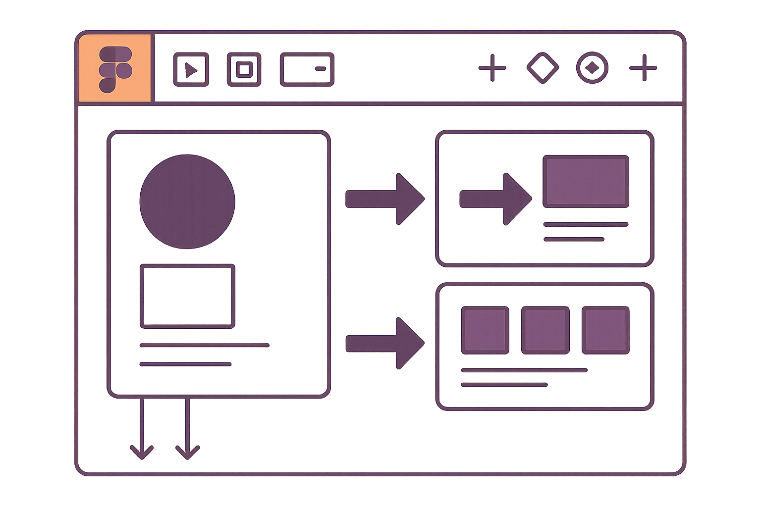
Auto Layout Is Your Best Friend (Use It Everywhere)
If you're still manually positioning elements in your portfolio, stop. Auto layout is the single most important Figma feature for portfolio work, and using it well is the clearest signal that you actually know the tool.
Think of auto layout like CSS flexbox — it handles spacing, alignment, and reflow automatically. When you add more text to a section, the page grows. When you rearrange case study blocks, spacing stays consistent. When a reviewer resizes their window, things don't overlap.
The Portfolio Page Pattern
Here's the auto layout structure I use for every portfolio page:
Page Frame (1440px wide, auto layout vertical)
  ├── Hero Section (auto layout vertical, padding 80px 72px)
  │   ├── Heading (fill width)
  │   ├── Subheading (fill width, max-width 720px)
  │   └── CTA Row (auto layout horizontal, gap 16px)
  ├── Project Grid (auto layout vertical, gap 48px, padding 80px 72px)
  │   ├── Project Card (auto layout horizontal, gap 32px)
  │   ├── Project Card
  │   └── Project Card
  ├── About Section (auto layout vertical, padding 80px 72px)
  └── Footer (auto layout horizontal, padding 40px 72px)
The key insight: every section is an auto layout frame with consistent horizontal padding (72px on each side for a 1440px frame gives you a ~1296px content area). This creates the visual rhythm that makes a portfolio feel cohesive instead of assembled from random pieces.
Auto Layout Tips That Actually Matter
Use “Fill container” width on text blocks
This makes your text reflow when you adjust the parent frame, just like responsive web text. Set a max-width on body text (600–720px) to keep line lengths readable.
Consistent gap values
Pick a spacing scale and stick to it: 8, 16, 24, 32, 48, 64, 80. Don't use 37px because it “looks right.” Systematic spacing is what separates professional work from hobby projects.
Wrap for grids
In Figma's auto layout, enable “Wrap” for project card grids. Set card width to a fixed size (say, 420px) and the grid will automatically wrap to two columns, three columns, or one — depending on the container width. This is huge for making your layout feel considered.
Absolute positioning for overlays
Sometimes you need an element to float over an auto layout — like a tag badge on a project card or a decorative element. Use absolute positioning within auto layout (the “pin” icon) instead of breaking out of auto layout entirely.
Components Worth Building
You don't need a full design system for a portfolio. But building a few smart components will save you hours and make your file feel polished. Here are the ones that earn their keep:
🃏 Project Card
This is the workhorse of your portfolio. Build it as a component with variants:
- • Default state — Project thumbnail, title, short description, and tags
- • Hover state — Slight scale-up or overlay with “View Case Study →”
- • Size variants — Full-width feature card and half-width grid card
Use component properties for the thumbnail image, title text, description, and tags. This way you swap content per instance without detaching the component.
🧭 Navigation Bar
Build a sticky nav with your name/logo on the left and page links on the right. Create a variant for the “current page” state (underline, bold, or color change on the active link). In prototype mode, you'll fix this to the top of each frame so it stays visible on scroll — just like a real website header.
📊 Metrics Row
A horizontal row of 3–4 key metrics for case studies: “40% increase in sign-ups,” “12-week timeline,” “4-person team.” Build this as a component with text properties for the number and label. Drop it at the top of every case study to immediately give reviewers context before they start reading.
💬 Pull Quote / Callout
A styled block for testimonials, key insights, or important callouts within case studies. Vertical line on the left, slightly larger italic text, maybe a subtle background color. Simple to build, but it breaks up walls of text beautifully and adds visual rhythm to long case study pages.
🏷️ Tag / Pill
Small component for skills, tools, project types. Use component properties for the label text and a variant for color (or just one neutral color — less is more). These are great on project cards and in your About section for listing your skillset.
A note on Figma Community plugins:
Unsplash for stock photos, Content Reel for placeholder text, and Remove BG for quick background removal are the three plugins I actually use for portfolio work. Skip the fancy animation plugins — they add complexity without adding value for a portfolio file.
Structuring Case Studies (The Part That Actually Gets You Hired)
Let me be blunt: your case studies are 80% of what matters in a design portfolio. The visual design of your portfolio site is the appetizer. The case studies are the meal. If you only have time to do one thing well, make it this.
Here's the structure I recommend. It's not the only way, but it works consistently across product design, UX, and visual design portfolios. For detailed guidance on what content to include and how to write compelling case studies, see our complete case study structure guide:
1. Hero + Context (First Viewport)
This is what the reviewer sees before they scroll. It needs to answer three questions instantly: What is this project? What was your role? What was the outcome?
- • Project title and one-sentence summary
- • A polished hero image or mockup (this is your hook — make it gorgeous)
- • Your metrics row component: role, timeline, team size, key result
- • Tags for tools and skills used
2. The Problem
Two to three paragraphs max. What was the business problem? Who were the users? What were the constraints? Don't write a novel — write enough that a reviewer understands why this project existed and why it was hard. Include a screenshot or photo of the “before” state if you have one. Nothing makes a redesign more compelling than showing what it replaced.
3. Process (Show, Don't Tell)
This is where most portfolios either shine or fail. The mistake is describing your process in text: “I conducted user research, then created wireframes, then iterated on the design.” That's a recipe, not a story.
Instead, show the artifacts. Embed your actual sketches, whiteboard photos, user journey maps, wireframes — the messy, real stuff. Put them in a clean layout with brief captions explaining what each artifact is and what decision it led to.
A particularly effective Figma technique: use sections with a light gray background (#F7F7F7) for process content and white backgrounds for final designs. This creates a visual hierarchy between “how I got there” and “what I shipped” without needing to explain it.
4. The Solution
Now show the final designs. This is your moment — make it count. Use high-fidelity mockups, real device frames, and generous spacing. Some approaches that work well in Figma:
- • Full-width hero shots — Let your best screens breathe at full 1440px width
- • Device mockups — Use Figma's community device frames (search “device mockup” in Community) to show mobile and desktop side by side
- • Detail callouts — Zoom into specific interactions or UI details with annotated close-ups
- • Embedded prototypes — Link to interactive Figma prototypes so reviewers can click through flows themselves
5. Results + Reflection
End with what happened. Did metrics improve? Did users respond positively? What would you do differently? This section doesn't need to be long — three to five sentences and maybe a metrics row showing before/after numbers. Hiring managers love seeing that you connect design decisions to business outcomes, even if the results are modest. Honesty about what you'd improve next time is a strength, not a weakness.
Prototype & Presentation Settings
A Figma portfolio isn't just static frames — it's an interactive presentation. Getting the prototype settings right is the difference between “here's a PDF in Figma” and “wow, this feels like a real website.”
Flow Starting Points
Set your Cover page as the default flow starting point. This is what people see first when they click your prototype link. Go to the Prototype panel, select your Cover frame, and click “Add flow starting point.” Name it something clear like “Portfolio” — not “Flow 1.”
Navigation Interactions
Connect your nav links and project cards to their destination frames using “On click → Navigate to” interactions. For transition animation, use “Smart animate” with “Ease in and out” at 300ms. This creates smooth page transitions that feel polished without being distracting.
Don't use “Move in” or “Push” transitions — they feel like a mobile app, not a portfolio website. Dissolve or Smart Animate are your only good options here.
Scroll Behavior
For case study pages that are taller than the viewport: select the frame, go to the Prototype panel, and set the overflow to “Vertical scrolling.” Set the frame height to match the viewport (900px for a 1440×900 setup) and let your content extend below it.
To make your navigation bar “sticky,” select the nav component instance, enable “Fix position when scrolling” in the Design panel, and position it at the top of your frame. Now it stays visible as the reviewer scrolls — exactly like a real website.
Presentation Mode Settings
When sharing your prototype link, choose your settings carefully:
- • Device — Set to “None” (you don't want your portfolio squeezed into a phone frame)
- • Background color — Match your portfolio's background color, or use a dark gray (#1A1A1A) for a presentation feel
- • Starting frame — Your Cover page
- • “Show Figma UI” — Uncheck this for a cleaner viewing experience
Pro tip for portfolio reviews:
When presenting your portfolio in an interview, share your screen with the Figma prototype in presentation mode — not the editor. Present it like a real website. Then, if they want to go deeper, offer to switch to the editor view so they can see your file structure, components, and layer organization. This two-stage reveal shows both your design output and your design process.
Free Templates Worth Using (And How to Actually Use Them)
Starting from a template isn't cheating — it's smart. The best designers in the industry use templates, frameworks, and existing patterns as starting points. The key is making it yours. Here are three Figma Community templates that are actually well-built:
Personal Portfolio by Sagar Shah36.8k duplicates
Clean, responsive layout with both mobile and desktop versions. This is the best “just get started” template — it uses proper auto layout, has a solid component library, and the design is neutral enough to customize without fighting it. Good for beginners.
Best for:Junior designers who want a professional structure to fill with their own content. Swap the fonts, adjust the colors, and you're 70% done.
Arik Portfolio by Pawel Gola11.7k duplicates
Bold, visually striking, with a strong typographic presence. This template has more personality than most — it feels like a real design portfolio, not a generic template. The layout structure is more opinionated, which means less customization work if the style fits you, but more work if it doesn't.
Best for: Designers with strong visual work who want their portfolio to feel as bold as their projects. Especially good for brand designers and visual/UI specialists.
Bentolio by Abdul Rauf18.6k duplicates
The trendy pick. Bento grid layouts are everywhere in 2025–2026, and this template does it well — clean cards, nice typography, and a modern aesthetic that photographs well (important if you're sharing screenshots on LinkedIn or Dribbble). The grid structure also makes it easy to rearrange sections.
Best for: Designers who want a contemporary, visually interesting layout without building complex structures from scratch.
How to Actually Customize a Template
The number one mistake with templates: changing the content but not the design. If I can tell you used Bentolio by looking at your portfolio, you haven't customized enough. Here's the minimum:
- 1. Change the fonts. Both heading and body. This alone makes a template unrecognizable.
- 2. Change the color palette. Pick a primary accent color that reflects your personality. Even just swapping blue for a warm terracotta completely changes the feel.
- 3. Adjust the spacing. Templates tend to be spacious. Tighten things up or loosen them to match your aesthetic.
- 4. Add or remove sections. Don't keep a “Testimonials” section if you don't have testimonials. Don't add a “Blog” section you'll never fill.
- 5. Replace all placeholder images. This seems obvious, but I've seen portfolios with template stock photos still in them. Not a good look.
Mistakes I See Constantly (And How to Fix Them)
I've reviewed hundreds of design portfolios. These are the mistakes that come up over and over — and they're all fixable in an afternoon.
Too many projects, not enough depth
Eight project thumbnails with no case studies tells me nothing about how you think. I'd rather see three projects with real process documentation than a grid of pretty screenshots. Cut ruthlessly.
Inconsistent spacing (the “eyeball it” problem)
If you're a designer and your own portfolio has inconsistent spacing, that's... not ideal. Use auto layout. Use a spacing scale. Zoom in and check. This is your craft — show that you care about the details.
Tiny body text
If your body text is smaller than 16px, people will struggle to read it in presentation mode. 18px body text with 28px line height is comfortable. Your portfolio is a reading experience — make it a pleasant one.
No hierarchy in case studies
A wall of text and images with no clear sections, no visual breaks, and no headings is exhausting to review. Use background colors to create sections. Use your heading styles. Add white space between major blocks. Guide the reviewer's eye. For more on creating effective visual hierarchy, see our design principles guide.
Broken prototype links
Nothing kills a portfolio review faster than clicking a navigation link and nothing happens. Test every single interaction in your prototype before sharing. Click every link. Scroll every page. Do this every time you update the file.
“Frame 247” layer names
If a reviewer inspects your file and sees unnamed layers everywhere, they'll wonder if you do the same on real projects. You probably do. Name your layers. It takes minutes and it signals professionalism.
Everything You Need to Know
Quick answers to help you get started
Share this resource

Written by
Nikki KippleProduct Designer & UX Strategist
Designer, educator, founder of The Crit. I've spent years teaching interaction design and reviewing hundreds of student portfolios. Good feedback shouldn't require being enrolled in my class — so I built a tool that gives it to everyone. Connect on LinkedIn →
Too close to your own work?
Send one screen, case study, or URL. We'll show what's working, what's getting skipped, and what to fix next.
Continue Reading
All resources →Get one actionable portfolio tip every week. No fluff.
Short reads you can use on your site. Unsubscribe anytime.