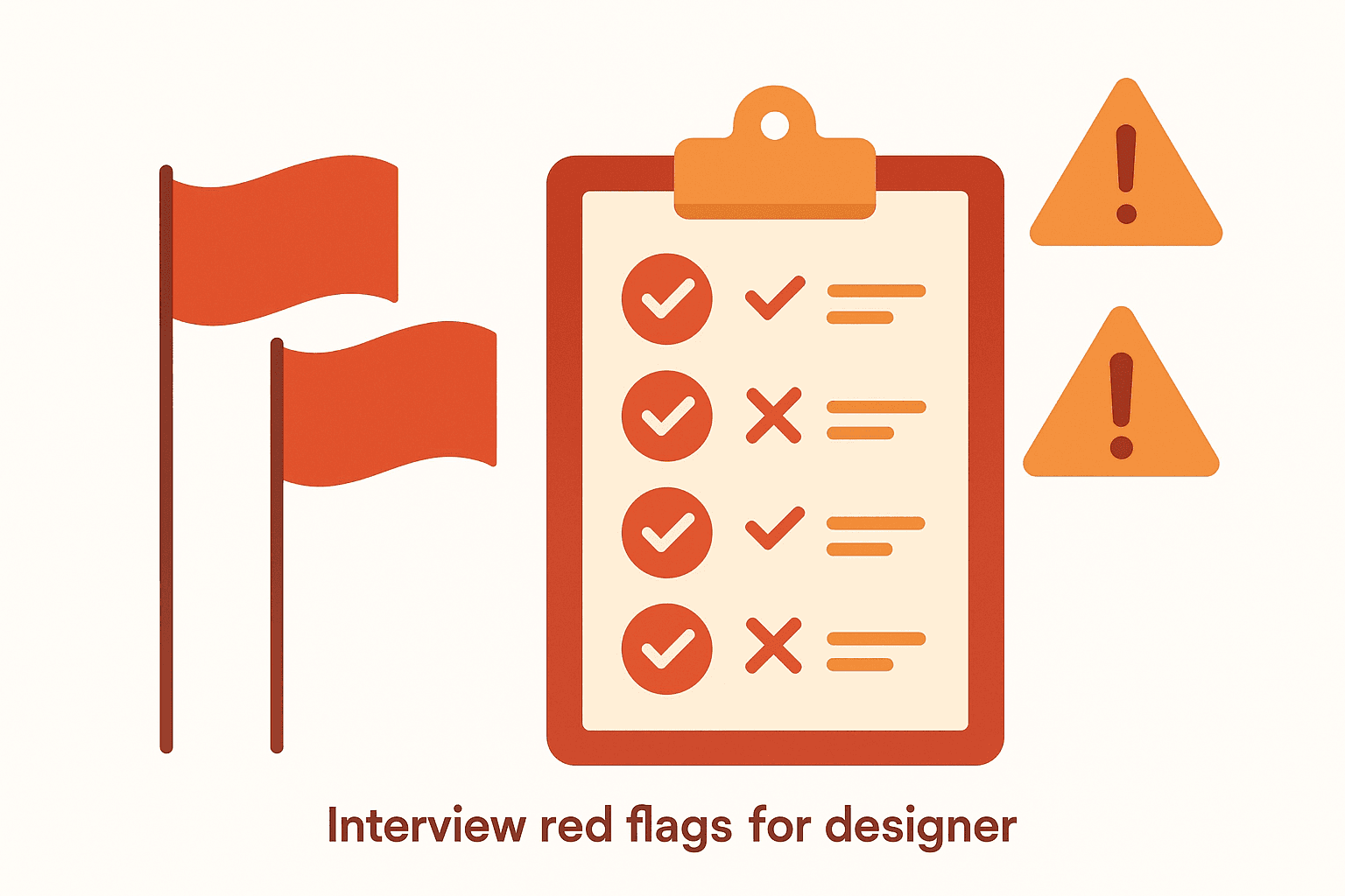
⚡ TL;DR
- • The problem: Most critique questions are too vague to produce useful feedback — "what do you think?" gets you opinions, not insights
- • The fix: 50+ specific, categorized questions that surface real problems in visual design, UX, content, technical execution, and strategy
- • The result: Critique sessions that actually improve work instead of generating polite nods and forgotten notes
Why Most Critique Questions Suck
Here's what happens in most critique sessions: someone presents their work, there's an awkward pause, and then somebody asks "so... what do you think?" And that's where things go sideways.
Open-ended vagueness is the enemy of useful feedback. When you ask "what do you think?" you get exactly what you asked for — what people think. Their opinions. Their preferences. Their gut reactions dressed up as professional observations. None of which tells the designer what to actually do differently.
The problem isn't that people are bad at giving feedback. It's that they're given no structure for it. A vague question produces vague answers. A specific question — "where does your eye land first on this screen, and is that the element you'd want users to interact with first?" — produces something actionable.
I've sat through hundreds of critiques. The ones that actually improved the work always had one thing in common: someone in the room asked better questions. Not more questions. Better ones.
What makes a critique question actually useful?
- •It's specific — it targets a particular aspect of the design, not the whole thing at once
- •It's observable — it asks about something the critic can actually see or experience in the design
- •It's goal-oriented — it ties back to what the design is trying to achieve
- •It's open enough for discussion — it invites explanation, not just yes or no
What follows is a bank of 50+ questions organized by category. You don't need all of them in every session — pick the ones that match the stage of the work and the type of feedback the designer is looking for. If you're not sure what a good design critique looks like, start there first.
Visual Design Questions
These questions focus on what the eye sees first, how the design communicates through visual language, and whether the visual choices support the intended message. Use them when the work has enough fidelity to evaluate layout, color, typography, and composition.
Layout & Hierarchy
- 1Where does your eye go first? Is that the most important element on the screen?
- 2How many levels of visual hierarchy can you count? Are they distinct enough to create a clear reading order?
- 3Is there a clear visual path through the content, or does the layout feel like everything is competing for attention?
- 4Does the spacing create logical groupings? Which elements feel connected and which feel isolated?
- 5If you squint at this screen, can you still identify the primary action and the content structure?
Color & Contrast
- 6Is the color palette doing any work beyond decoration? What is it communicating?
- 7Would this design still work if you removed all color and relied only on size, weight, and position?
- 8Are the interactive elements visually distinct from static content? Could you tell what's clickable without hovering?
- 9How does the contrast hold up on a low-brightness screen or in direct sunlight?
Typography & Readability
- 10Does the type scale create a clear relationship between headings, subheadings, body text, and captions?
- 11Are the line lengths comfortable for sustained reading, or do they stretch too far across the screen?
- 12Is the font choice reinforcing or fighting the tone of the content?
- 13How does the typography respond at different viewport sizes — does the hierarchy hold, or does it flatten?
UX & Interaction Questions
These go beyond what the design looks like and into how it works. Flows, usability, edge cases, and the spaces between screens where users often get lost. If you're running a structured critique session, these are the questions that usually generate the most discussion.
Flows & Navigation
- 14What's the primary action on this screen? Can you identify it within 3 seconds?
- 15If a user arrives here with zero context, what would they do first? Is that what you want them to do?
- 16How does this screen connect to what came before and what comes after? Does the transition feel natural?
- 17Can the user always get back to where they came from? Is the exit path as clear as the entry?
- 18What happens when the user completes the task? Is there clear confirmation and a logical next step?
Usability & Edge Cases
- 19What does this look like with no data? What about with way more data than expected?
- 20What happens when something goes wrong? Is there an error state, and does it help the user recover?
- 21How does this experience change on a phone versus a desktop? Where would the breakpoints feel awkward?
- 22Could someone navigate this entire flow using only a keyboard? Where would they get stuck?
- 23What assumptions about the user does this design make? Are those assumptions valid for all user segments?
Accessibility
- 24If all color were removed, would the information still be understandable? Is color the only differentiator for any element?
- 25Are the touch targets large enough for someone with limited fine motor control?
- 26How would a screen reader describe this page? Does the reading order match the visual order?
Content & Communication Questions
Design is communication. These questions evaluate whether the words, labels, and messaging are doing their job — or whether the design is relying on visual cues to compensate for unclear copy. In most critiques I've run, the biggest improvements come from content changes, not layout changes.
- 27Can you understand what this page does from the headline alone — without reading anything else?
- 28Are the labels self-explanatory, or would a first-time user need a tooltip to understand what something means?
- 29Does the button text accurately describe what will happen when the user clicks it?
- 30Is the microcopy setting the right expectations? Will users be surprised by what happens next?
- 31Does the tone match the context? A payment error needs different energy than a welcome message.
- 32Is there anywhere the design uses jargon or internal terminology that a real user wouldn't recognize?
- 33If you covered all the visuals and read only the text — would the page still make sense?
- 34Is the most critical information front-loaded in headings and first sentences, or buried in paragraphs?
Technical Questions
These questions bridge design and engineering. You don't need to be a developer to ask them, but they surface problems that only become expensive once the build starts. Asking these early saves weeks of rework.
- 35Are there any interactions or animations here that would be technically difficult or expensive to build?
- 36Does this design reuse existing components from the system, or does it introduce new patterns?
- 37How does this perform with real data at scale? What happens with 2 items, 200 items, or 2,000?
- 38What's the loading experience? Is there a skeleton state, a spinner, or does the user just stare at a blank screen?
- 39Are there performance-heavy elements — large images, complex animations, or heavy data fetching — that could slow the page down?
- 40Does this design degrade gracefully on slow connections? What does the user see while content loads?
- 41Is there anything here that requires real-time data? If so, what happens when the data is stale or the connection drops?
- 42How would this need to change to support localization — different text lengths, RTL languages, or cultural differences?
Strategic Questions
These zoom out from pixels and patterns to ask whether the design is solving the right problem in the right way. Strategic questions are best asked early in the process — before the team has invested too heavily in a direction — but they're valuable at any stage.
- 43What problem is this design solving, and is it the most important problem to solve right now?
- 44How will we know if this design is successful? What would we measure?
- 45What's the biggest risk with this approach? What could go wrong that we haven't accounted for?
- 46What did we decide not to include, and why? Are those trade-offs still the right ones?
- 47How does this fit into the broader product experience? Does it feel like it belongs here?
- 48Is this the simplest version of the solution, or have we added complexity we don't need yet?
- 49Who are we designing this for? How confident are we that we understand their actual needs versus our assumptions?
- 50If a competitor shipped this exact same feature tomorrow, what would make ours better?
Questions to Avoid in Design Critique
Not all questions are created equal. Some questions feel like they're contributing to the discussion, but they actually derail it. They introduce bias, shut down exploration, or turn the critique into a debate about taste. Here are the patterns to watch out for.
| Question to Avoid | Why It's a Problem | Ask This Instead |
|---|---|---|
| "Don't you think it would look better if...?" | Leading question — embeds a preference disguised as curiosity | "What alternatives did you consider for this element?" |
| "What do you think?" | Too vague — invites opinions instead of observations | "What stands out to you first, and does that match the goal?" |
| "Why didn't you use [specific pattern]?" | Assumes a specific solution is correct — puts designer on defense | "What led you to this approach over other patterns?" |
| "Is this done?" | Evaluative — implies the work should be finished, creates defensiveness | "What stage is this at, and what kind of feedback would be most helpful?" |
| "Can you make it pop more?" | Subjective and unactionable — means different things to everyone | "The primary CTA doesn't have enough contrast to stand out — how could we increase its visual weight?" |
| "Is this accessible?" | Too broad — accessibility covers dozens of specific criteria | "Does this color combination meet WCAG AA contrast ratios?" |
The common thread
Bad critique questions share the same DNA: they're either too vague to act on, too leading to be genuine, or too evaluative to be collaborative. A good rule of thumb: if your question already contains the answer you're hoping for, it's not a question — it's a suggestion wearing a disguise. Say what you mean directly. "I think we should try X because Y" is more honest than "Don't you think X would be better?"
For more on the difference between useful and useless feedback, our design feedback best practices guide goes deeper into the mechanics of giving critique that actually helps.
Building a Question Toolkit
Having 50+ questions is great. Knowing which 5 to use in a given session is better. Here's how to turn this list into a toolkit that's actually practical.
For Early-Stage Work
Wireframes, sketches, concepts
Focus on strategic and UX questions. The visual details aren't there yet, so don't ask about typography or color. Instead:
- •Is this solving the right problem?
- •Does the flow make sense?
- •What are we assuming about the user?
For Mid-Stage Work
Mockups, prototypes, mid-fidelity
This is where the full range opens up. Visual, UX, and content questions are all fair game:
- •Does the hierarchy guide the eye correctly?
- •Are the interactions intuitive?
- •Does the copy set the right expectations?
For Pre-Handoff Work
High-fidelity, polished, near-final
Shift toward technical and detail-oriented questions. The big decisions are made — now it's about polish:
- •Are edge cases handled?
- •Will this be expensive to build?
- •Does it reuse existing components?
For Self-Critique
Before sharing with anyone
Run through a quick check before showing your work. It's harder to be objective about your own designs, but:
- •What would I critique if someone else made this?
- •Where am I defending a choice out of ego?
- •What's the weakest part I'm hoping nobody notices?
Your pre-session prep (2 minutes)
- 1Know the stage. What fidelity is the work at? Match your questions to it.
- 2Know the ask. What type of feedback is the designer looking for? Respect the scope.
- 3Pick 3-5 questions. From the relevant categories. Write them down so you don't forget.
- 4Leave room for follow-up. The best questions come from listening to the discussion, not from your pre-written list.
The goal isn't to memorize all 50 questions. It's to develop the instinct for asking the right kind of question at the right moment. Over time, good critique questions stop being something you look up and start being how you naturally think about design. That's when you know it's working.
The Bottom Line
The difference between a critique that improves work and one that wastes everyone's time almost always comes down to the questions being asked. Vague questions get vague feedback. Specific, goal-oriented questions surface problems that would otherwise ship to users.
You don't need all 50+ questions in every session. You need the right 3-5 for the stage of the work, the type of feedback requested, and the goals of the project. Build your own shortlist, refine it over time, and share it with your team.
And if you want a shortcut — upload your design to The Crit and get structured feedback that covers visual, UX, content, and accessibility questions automatically. It won't replace your team critique sessions, but it'll make them a lot more focused.
Want structured critique without the awkward silences?
Upload your design and get specific, categorized feedback across visual design, UX, content, and accessibility — in seconds.
Try The Crit FreeEverything You Need to Know
Quick answers to help you get started